
Dear community,
I've been tinkering with enrichplot's dotplot and gseaplot2 for the past few days trying to make GSEA plots for use in a publication. The data is from a RNASeq experiment (mouse) which has been analyzed with DESeq2 to find differentially regulated genes, which were further analyzed with clusterProfiler using GSEA with GO and MSigDB gene sets (great package!). Due to size constraints, I want to specify the dimensions of the plots and export them as svg so that I have some flexibility when putting the figures together in Illustrator.
My issue is that the plots look great in R, but when I export them with ggplot and specify the dimensions, some plot elements, like dots and lines, do not scale down enough.
For example, I created a dotplot of the top 9 GO:BP categories and saved them as svg and png:
p_go <- dotplot(gse, showCategory=9, split=".sign", x="NES", decreasing = TRUE, font.size = 6, label_format = 30) +
  scale_x_continuous(limit = c(-3, 3), breaks=seq(-3,3,1)) +
  geom_vline(xintercept = 0, linetype="dotted", color = "#444444", size=1) +
   theme(
    legend.text=element_text(size=5),
    legend.position = "bottom",
    legend.box = "vertical",
    text = element_text(size=6))
p_ggo
ggsave("output/clusterProfiler_dotblot_0.0001_unscaled.svg", width = 12, height = 10, units = "cm")
ggsave("output/clusterProfiler_dotblot_0.0001_unscaled.png", device = agg_png, width = 12, height = 10, units = "cm")
Which gives me (PNG and SVG look the same, so just showing the PNG):
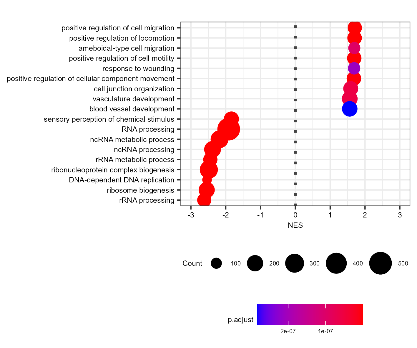
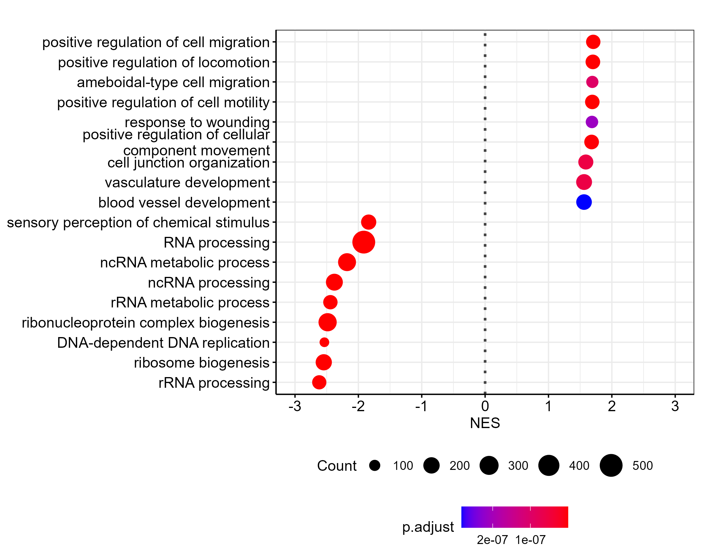
The dots are too big for a plot this size. I worked around this by creating the same plot with two times the font size, and then scaling down by 0.5 during export (using ragg):
ggsave("output/clusterProfiler_dotblot_0.0001_scaled.png", width = 12, height = 10, scaling = 0.5, device = agg_png, units = "cm")
Which is the result I am after, but I'd like to export the plot as svg. Do you know of a way to do this?
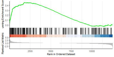
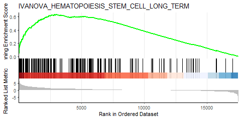
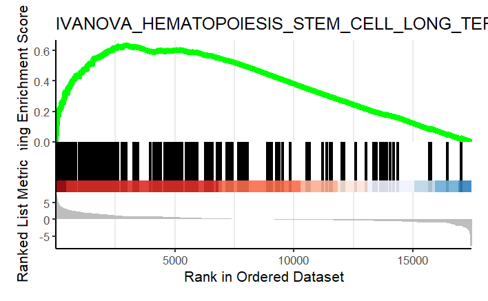
Similarly, I performed GSEA with MSigDB sets and used gseaplot2 to visualize the results:
display_geneset <- "IVANOVA_HEMATOPOIESIS_STEM_CELL_LONG_TERM"
p_msig <- gseaplot2(gse_cgp, geneSetID = display_geneset, title = gse_cgp$Description[gse_cgp$ID == display_geneset],
               color = "green", base_size = 5) + theme( aspect.ratio = 1/1.618)

p_msig
ggsave("output/clusterProfiler_GSEA_IVANOVA_small.svg", width=6, units = "cm", scale = 1)
Producing the left image:
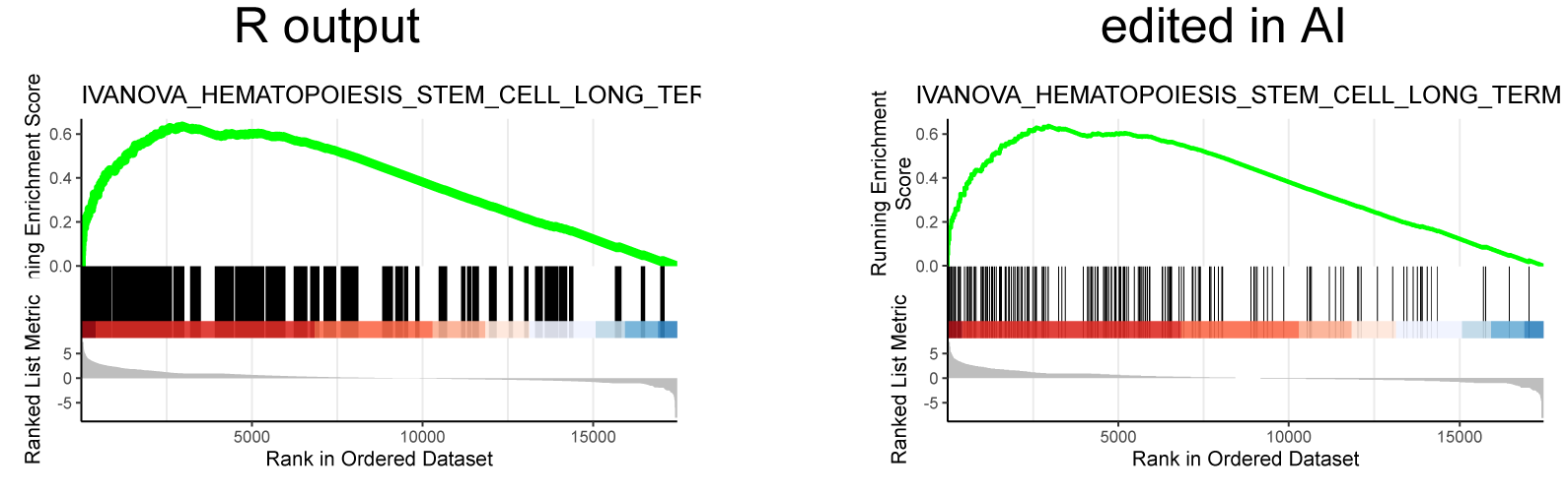
I was able to downscale the lines in Illustrator, ultimately getting what I want (right), but is there a more straightforward and elegant way to do this?
Any help would be greatly appreciated!
sessionInfo( )
R version 4.1.0 (2021-05-18)
Platform: x86_64-w64-mingw32/x64 (64-bit)
Running under: Windows 10 x64 (build 19041)

Matrix products: default

locale:
[1] LC_COLLATE=Japanese_Japan.932  LC_CTYPE=Japanese_Japan.932
[3] LC_MONETARY=Japanese_Japan.932 LC_NUMERIC=C
[5] LC_TIME=Japanese_Japan.932
system code page: 1252

attached base packages:
 [1] parallel  stats4    grid      stats     graphics  grDevices utils     datasets
 [9] methods   base

other attached packages:
 [1] org.Mm.eg.db_3.13.0   AnnotationDbi_1.54.1  IRanges_2.26.0        S4Vectors_0.30.0
 [5] Biobase_2.52.0        BiocGenerics_0.38.0   egg_0.4.5             gridExtra_2.3
 [9] forcats_0.5.1         stringr_1.4.0         dplyr_1.0.7           purrr_0.3.4
[13] readr_1.4.0           tidyr_1.1.3           tibble_3.1.2          tidyverse_1.3.1
[17] extrafont_0.17        ragg_1.1.3            svglite_2.0.0         msigdbr_7.4.1
[21] ggridges_0.5.3        DOSE_3.18.1           ggplot2_3.3.5         enrichplot_1.12.2
[25] clusterProfiler_4.0.2

 Like the svg I posted earlier.
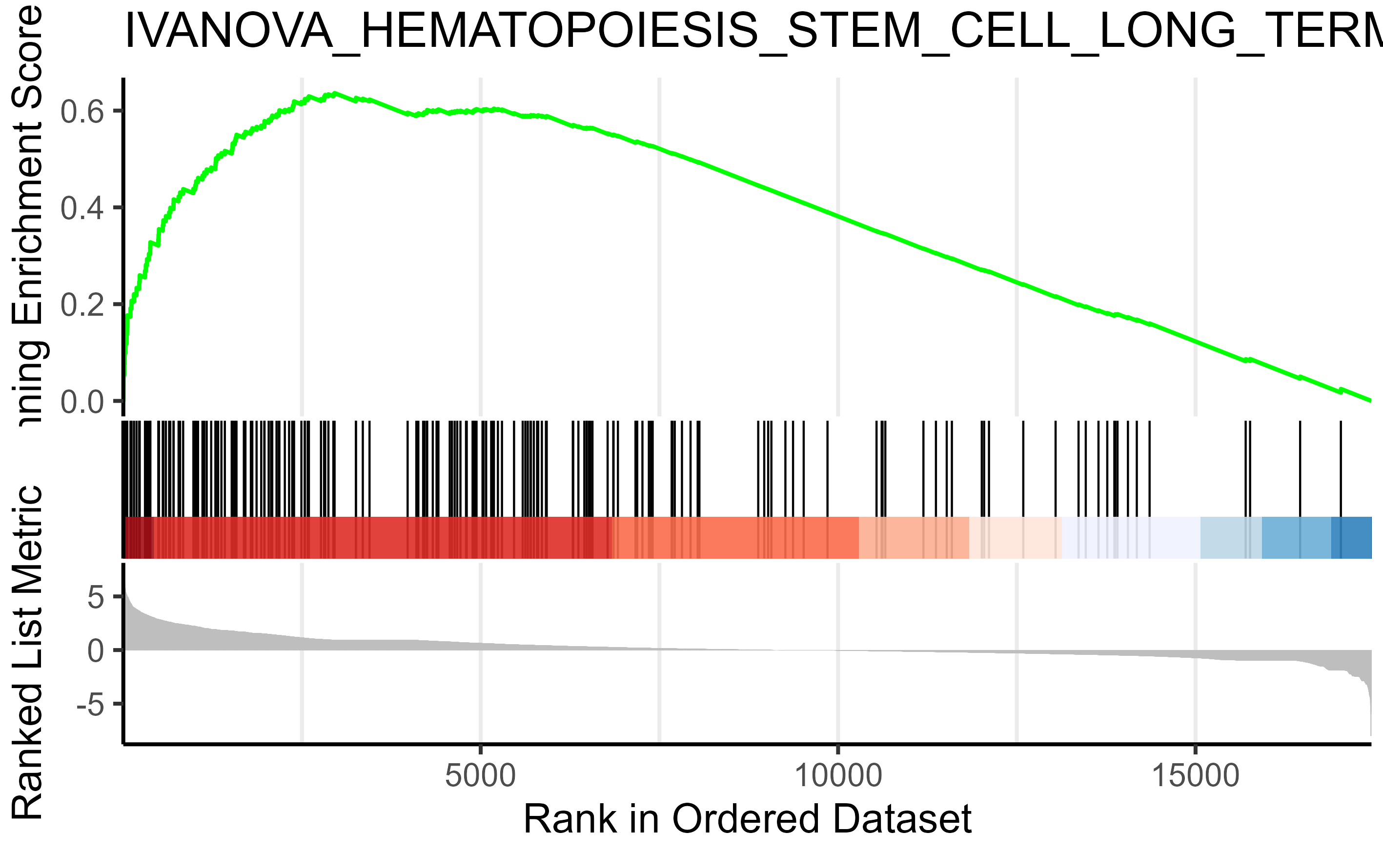
dotplot() + scale_size(range = c(1,5) should work