Unusal standard deviation after rlog transformation and the homoscedasticity of the data
1
0
Entering edit mode
BT ▴ 10
@8dfa184d
Last seen 16 months ago
Sweden

I am trying to plot a sample heatmap for RNA-seq data. I used rlog to transform count data since I have only 6 samples. The sample heatmap did not have a good cluster so I tried transforming the data with VST. 
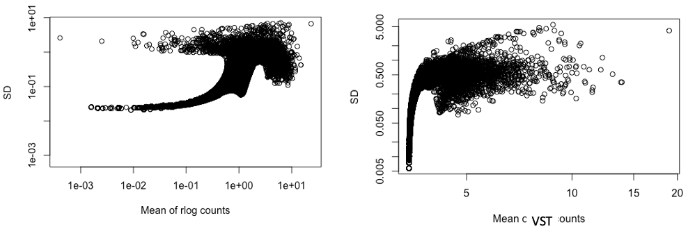
I then tried to plot the standard deviation against the mean of transformed counts by rlog and VST, both figures have a log scaled axis (see figures below, left is SD & mean of rlog count, and right is for VST counts) Could you please explain why the SD of the rlog counts looks that way and is this abnormal? I was expecting that after the transformation, the gene with higher mean values will have SD scattered in the same range (similar to the right figure) meaning that the data becomes more homoscedastic, is this a correct assumption? previously, I used rlog on data from another cell line (the SDvMean plot looks okay for that one), so I prefer to use rlog for consistency, when possible. SD and mean of transformed count data

rlog DESeq2 VST • 750 views
ADD COMMENT
1
Entering edit mode
@mikelove
Last seen 49 minutes ago
United States

I'm guessing this data does not conform well to the assumptions of the rlog, which are that variation is distributed a certain way from expected value across all samples.

We don't recommend rlog anymore in the current vignette or workflow, because the VST appears more stable across many different types of dataset. So I would just drop rlog and use VST here.

ADD COMMENT

Login before adding your answer.

Traffic: 1128 users visited in the last hour
Help About
FAQ
Access RSS
API
Stats

Use of this site constitutes acceptance of our User Agreement and Privacy Policy.

Powered by the version 2.3.6