We are performing differential expression analysis on a matched dataset of around 400 samples. This dataset consists of pairs (cases and controls) highly matched on various variables. We ran DESeq2 to find genes differentially expressed between cases and controls taking into account batch effects and the fact samples are paired (design = ~ Pair + Batch + Case/Control; note: before running DESeq2 we filtered out genes lowly expressed).
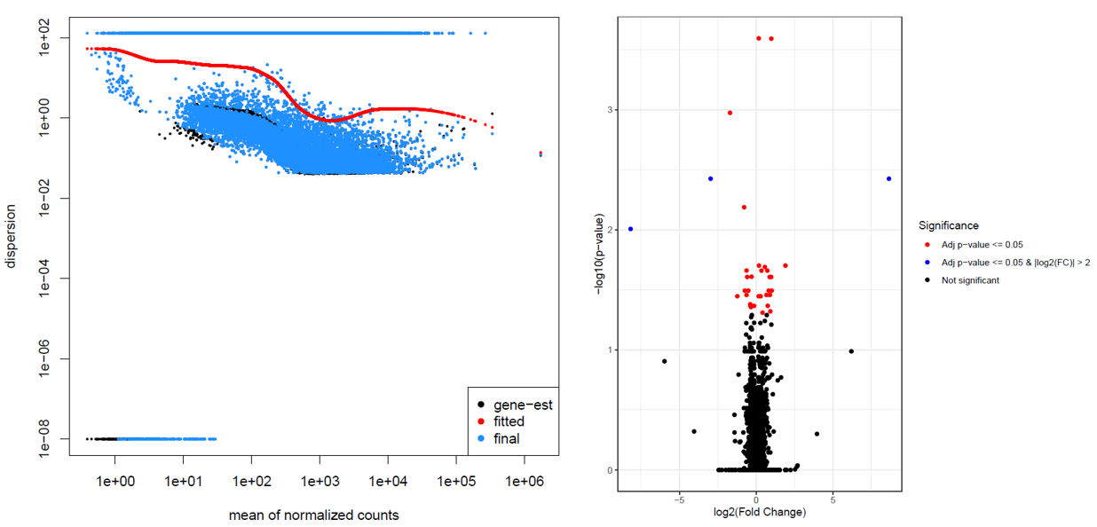
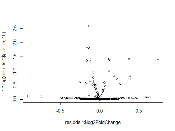
This resulted in weird dispersion and volcano plots.
In the dispersion plot, there are many genes with high dispersion. They are involved in the “parabola” shape seen in the volcano plot. We have already performed some checks including looking at the PCA plot, running DESeq2 excluding the Pair variable, substituting the Pair variable with variables used in the matching, and we did not notice any unexpected behavior.
Has anyone experienced something similar and knows the cause of these results? What is the relation between high dispersion values and paired analysis? What will be the recommended approach(es) for studies with many paired samples such as ours?
Thanks in advance.


Hi Michael Michael Love , thanks for your reply. We have already checked for other possible batch effects by looking at all the available variables. We are aware that there are some variables affecting gene expression (such as sex), but these were used for the matching, so by using the
Pairvariable they should have been already taken into account. In addition, if there were other batch effects that would cause this high dispersion I guess we would be able to see a similar high dispersion behavior withdesign = Batch + Case/Control. Here's the PCA with samples labeled as Case = 1 or Control = 0.We also looked at plotCounts for a gene with high dispersion (left) and a gene with normal dispersion (right). I find it hard to see any difference between them.
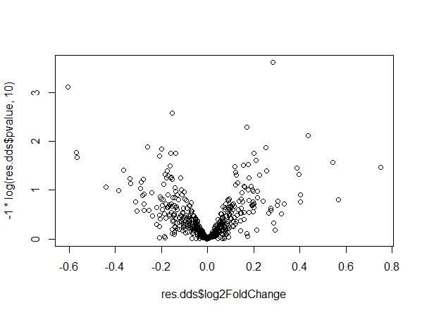
We currently believe that the problem might be related to the number of pairs, but we don't have a full understanding of why/how this happens. We tried to reproduce our problem with simulated data. We created a dataset with 296 samples and ran DESeq. Here dispersion and volcano plots look normal.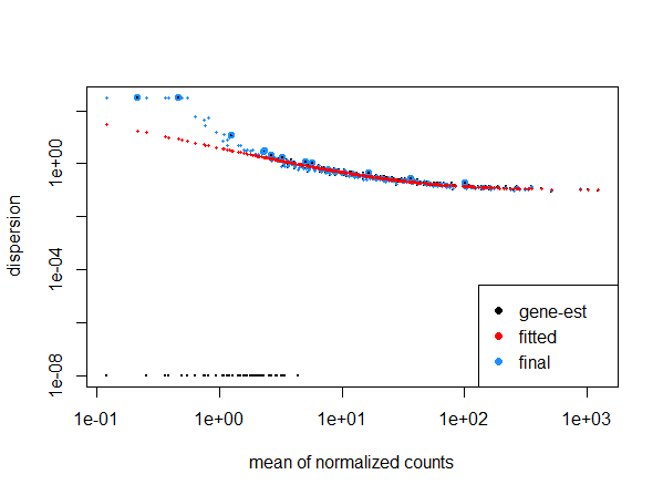
If we add 2 more samples to the dataset, dispersion and volcano plots become weird and similar to what we obtained.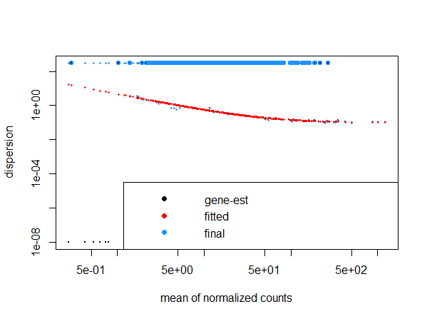
Sorry I missed that you have a paired design. You would have to look at the delta within pair to understand why the dispersion is high or low.
Are the pairs mostly within the same batch?
Michael Love I plotted the delta counts for 16 genes with high dispersion and 16 with "normal" dispersion and still find it hard to see differences between them (numbers in the plots indicate the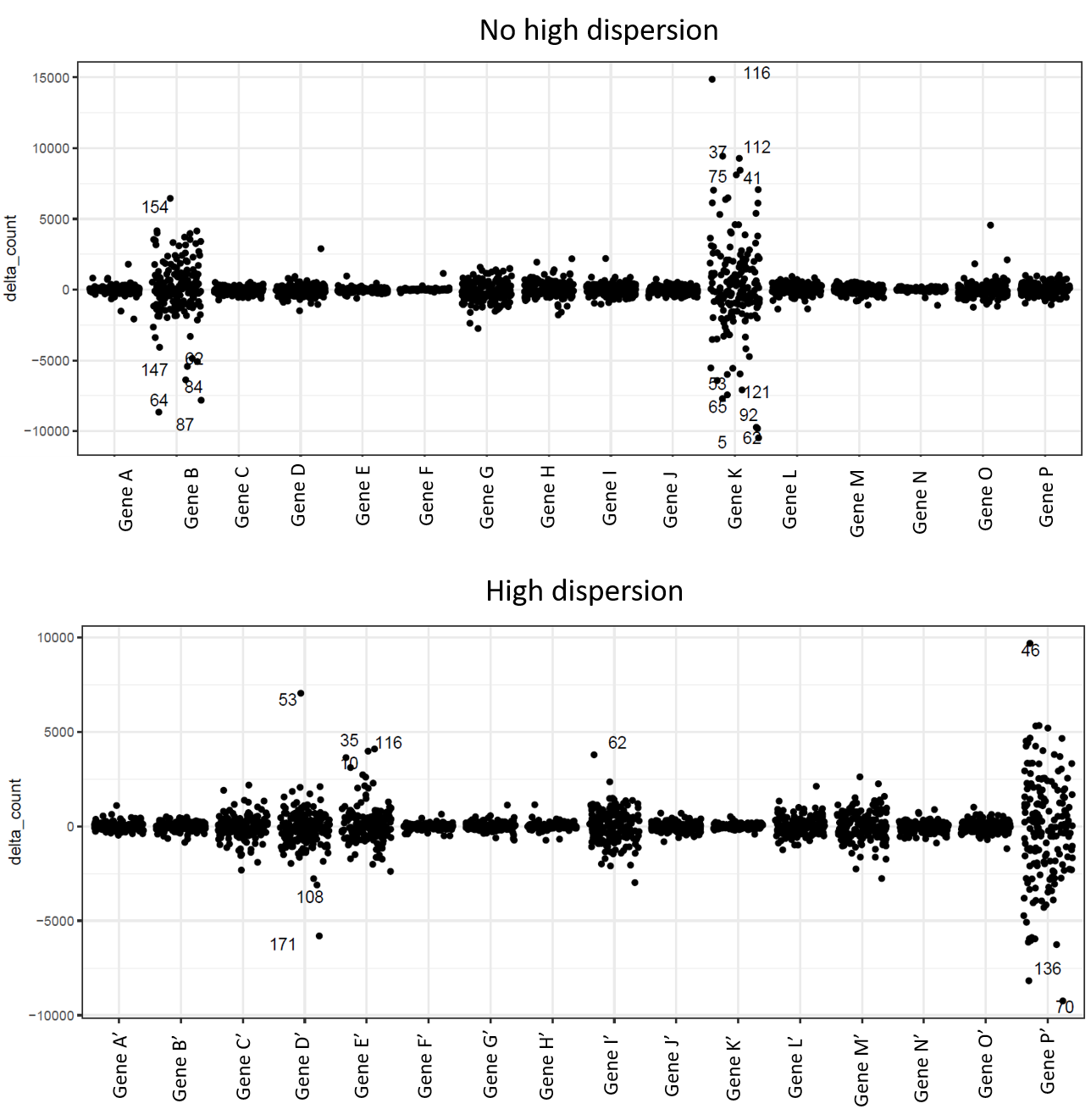 I'm also not too sure what should be the difference. From what I understood, I should see more variance in genes with high dispersion compared to genes with normal dispersion, which is not the case in these plots. Did I understand it correctly?
Pairid).Regarding your question on the pairs: yes, most pairs are within the same batch.
It's tricky to plot the delta like this because variance naturally depends on average count. I usually plot pairs with
ggplot(aes(condition, count, group=pair))Michael Love do you mean to color
Pairwith different colors? In our case, we have almost 200 pairs so it's hard to visualize them by colors.We believe that the "problem" is due to the number of pairs (see the previous example with code) instead of being related to our dataset as the same behavior can be reproduced with a simulated dataset. Can it be the case?
I don't think there's any limit to the number of pairs, but for hundreds of coefficients to estimate, I personally would use limma-voom.