Hi Thanks for all your work..
I saw the slides on spatialLIBD posted up this week... and I've just finished building a list of genes that are differentially upregulated in cortex, which I'm now expanding to 13 lists. I'm running the gene set enrichment in the cortical layers, and I'd like to plot the enrichments using gene_set_enrichment_plot() - similarly to the asd_sfari example.
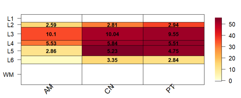
I was having a problem with the plot being squashed up (this plot was run with pThresh set to 60). A litle bit odd because I ran the asd_sfari example in a different R session from the Vignette and it seemed to look ok. (On review, it also looked a bit squashed up.. a top margin of 8 worked a bit better).
I've run through the underlying code - for gene_set_enrichment_plot() and then layer_matrix_plot(). It seems that a top margin of 12 is hard-coded in gene_set_enrichment_plot() and is inaccessible to the user. When running through the code manually, layer_matrix_plot() calls fields::image_plot() - and I get an error: "Error in plot.new() : figure margins too large" and it doesn't print. It prints without error (as in the above plot) if I run it via gene_set_enrichment_plot().
Relevant line in the source: https://github.com/LieberInstitute/spatialLIBD/blob/devel/R/gene_set_enrichment_plot.R#L154
Setting mar to (4 4 4 2) when I run through the code produces this:


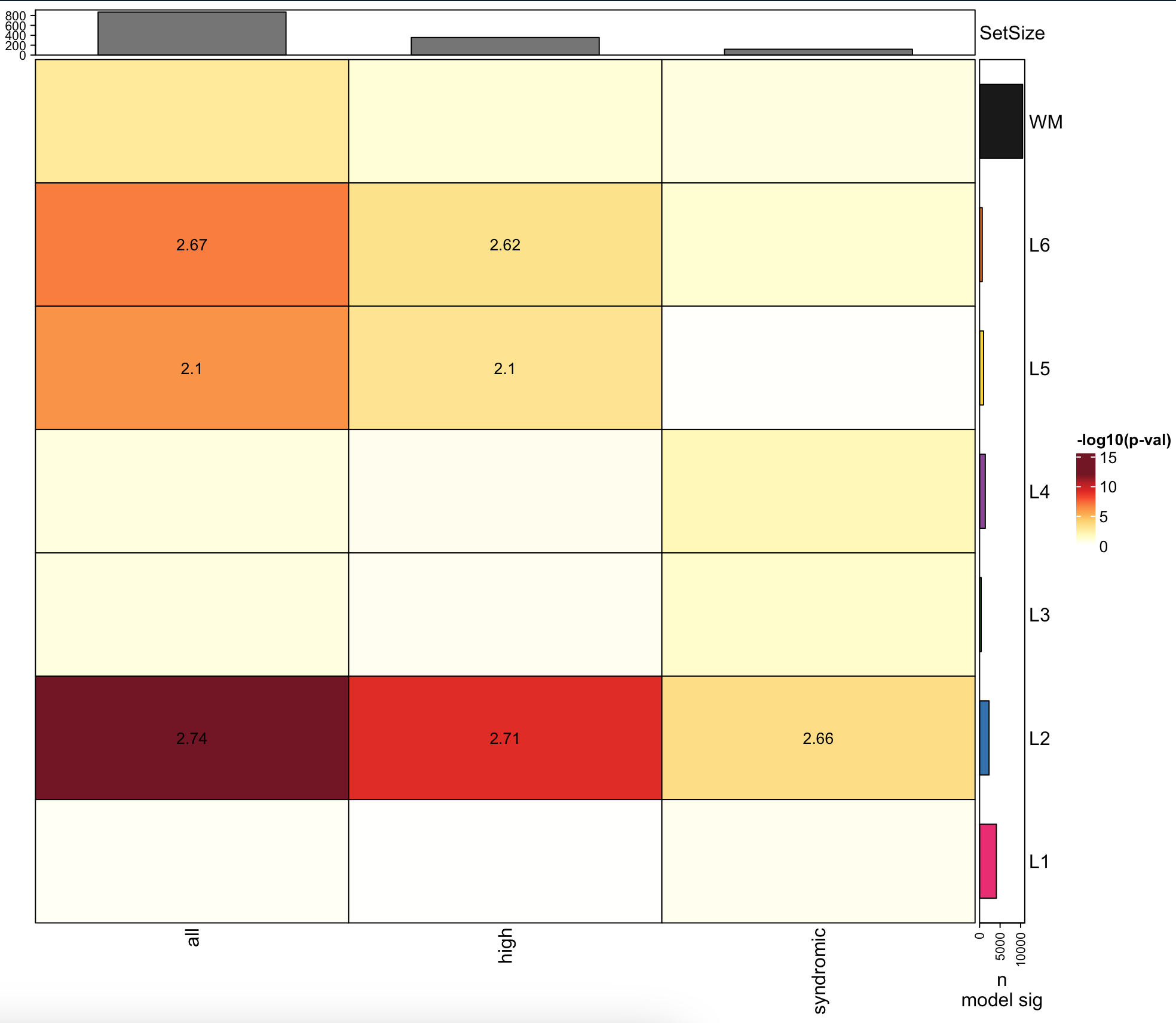
Thanks! This one might be worth remaking with
ComplexHeatmap. Similar to https://github.com/LieberInstitute/spatialLIBD/pull/91 that was just submitted by Louise Huuki-Myers.