Entering edit mode

rogerbear
•
0
@user-24731
Last seen 3.2 years ago
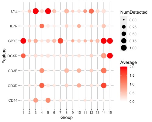
Hi, I am trying to plot the detected expression values and average expressions of marker genes for my clustering result. I have a list of genes in genelist as the marker genes to be plotted on the y axis. But the function sort my marker gene by name each time which is not the same as their orders in my genelist. Is there a way to stop this? I also wonder if it is possible to exchange x and y axis so that the feature names are on x axis and cluster names are on y axis.
genelist
[1] "GPX3" "DCXR" "LYZ"  "CD14" "CD3D" "IL7R" "CD3E"
plotDots(sce, genelist, group = "label", swap_rownames = "Symbol", max_ave = 2)
![plotDots()_result][1]

sessionInfo( )
R version 4.0.3 (2020-10-10)
Platform: x86_64-apple-darwin17.0 (64-bit)
Running under: macOS Big Sur 10.16

Matrix products: default
LAPACK: /Library/Frameworks/R.framework/Versions/4.0/Resources/lib/libRlapack.dylib

locale:
[1] en_US.UTF-8/en_US.UTF-8/en_US.UTF-8/C/en_US.UTF-8/en_US.UTF-8

attached base packages:
[1] parallel  stats4    stats     graphics  grDevices utils     datasets  methods   base

other attached packages:
 [1] scran_1.18.3                scater_1.18.3               ggplot2_3.3.3               SingleCellExperiment_1.12.0
 [5] SummarizedExperiment_1.20.0 Biobase_2.50.0              GenomicRanges_1.42.0        GenomeInfoDb_1.26.2
 [9] IRanges_2.24.1              S4Vectors_0.28.1            BiocGenerics_0.36.0         MatrixGenerics_1.2.1
[13] matrixStats_0.58.0          readxl_1.3.1

loaded via a namespace (and not attached):
 [1] viridis_0.5.1             edgeR_3.32.1              BiocSingular_1.6.0        viridisLite_0.3.0         DelayedMatrixStats_1.12.2
 [6] scuttle_1.0.4             assertthat_0.2.1          statmod_1.4.35            dqrng_0.2.1               GenomeInfoDbData_1.2.4
[11] vipor_0.4.5               cellranger_1.1.0          ggrepel_0.9.1             pillar_1.4.7              lattice_0.20-41
[16] glue_1.4.2                limma_3.46.0              beachmat_2.6.4            digest_0.6.27             XVector_0.30.0
[21] colorspace_2.0-0          cowplot_1.1.1             Matrix_1.3-2              plyr_1.8.6                pkgconfig_2.0.3
[26] zlibbioc_1.36.0           purrr_0.3.4               scales_1.1.1              BiocParallel_1.24.1       tibble_3.0.6
[31] generics_0.1.0            farver_2.0.3              ellipsis_0.3.1            withr_2.4.1               cli_2.3.0
[36] magrittr_2.0.1            crayon_1.4.0              bluster_1.0.0             beeswarm_0.2.3            tools_4.0.3
[41] lifecycle_0.2.0           stringr_1.4.0             munsell_0.5.0             locfit_1.5-9.4            DelayedArray_0.16.1
[46] irlba_2.3.3               compiler_4.0.3            rsvd_1.0.3                rlang_0.4.10              grid_4.0.3
[51] RCurl_1.98-1.2            BiocNeighbors_1.8.2       igraph_1.2.6              bitops_1.0-6              labeling_0.4.2
[56] gtable_0.3.0              DBI_1.1.1                 rematch_1.0.1             reshape2_1.4.4            PCAtools_2.2.0
[61] R6_2.5.0                  gridExtra_2.3             dplyr_1.0.4               stringi_1.5.3             ggbeeswarm_0.6.0
[66] Rcpp_1.0.6                vctrs_0.3.6               tidyselect_1.1.0          sparseMatrixStats_1.2.0
>


thanks for your reply, I found the scale_y_discrete really helpful, and I explored the scale_x_discrete which made my dot plot looks better.
Great! Glad I could help :)