
Hi, there:
I have a general question for limma R package: I have used limma package for many occasions of microarray datasets in the past, but besides microarrays, RNA-seq (with voom) and quantitative PCR data as primarily mentioned that limma can be used for. What about other types of high-thoughput data that can be used for limma analysis? Although linear model usually requires Linearity,Homoscedasticity,Independence, and Normality etc, quantitative PCR data may not necessarily meet all these criteria. So my question is: Is there a need or general principle/rule to assess whether the data types/distribution etc is suitable for limma analysis to derive differential features between interested contrasting groups? for example, one dataset I wish to use limma was derived from high-throughput assays, and had been scaled between around -2 and 1 (and we can essentially treat the data as log2 intensity like in microrray and high values mean highly expressed etc for the same probe after normalized), since more posiitve and more negative have opposite biological meanings. Another dataset we have is compound labeling high throghput assays for interested protein at intended sites/pockets as percentage levels of successful labeling, data ranged from 0 to 100%. highly lableing % certainly is favored as for good compounds. Maybe I shall log transform the percentage data if can be used for limma analysis?
I was wondering about the potentials/possibilities of using limma in these datasets. Any advice would be highly appreciated! Thanks a lot in advance! Ming

Dear Dr. Smyth:
Really appreciate the time you took and the inputs you wrote on my questions, very helpful and informative!
I have a bit follow-ups to be clarified further and looking forward to your advice.
Data that are constrained between limits (such at 0 and 100%) have strong mean-variance relationships at both boundaries and hence are not generally suitable for linear modelling.
for dataset scaled between -2 and 1 using some internal controls etc, which is actually not bounded strictly by this boundary, the data can be higher or lower than the boundaries dependent upon samples or cell lines, although majority of the data is falling within this interval. My question is: do I need to run through procedures to check data normality (such as qqplot etc),or formally via a normality test (Shapiro-Wilk test for instance) etc?
Indeed, for this dataset (scaled between -2 and 1), I did check histogram quickly and found the data in rough bell shaped. And indeed I already applied limma quickly to some interested contrasts within the data and already found some very interesting findings that make quite biological sense, which is why I am really hoping that the limma method can be suitable for the dataset. That is why I am asking if there is standard procedure to assess if the datasets are suitable for limma method at beginning?
For the percentage dataset (bounded by 0 to 100 (%)),you suggested that the original data is not suitable for limma, and also log transform is not working here. Although you suggest variance-stabilizing transformation, do you mean that after variance-stabilizing transformation, I can use limma on the transformed data? And for variance-stabilizing transformation, I found some potential R packages DDHFm and vsn, and DESeq2 package has vst transformation for RNAseq data, can you specifically suggest one R function or package that is suitable to use for limma analysis? I am also a bit concerned if these transformation ways are relatively dramatic. In these percentage data, higher percentage means better compound labeling capacity, not sure if these transformations still maintain the meaning of these values although it allows the limma analysis if my understanding is correct.
Thx in advance! Ming
No. Such tests are both impossible and unnecessary.
It is much more relevant to use limma's provided plots, especially plotSA but also plotMDS and plotMD.
No, you cannot check normality with a histogram. limma does not make any assumption that the data appears normal in a histogram. limma also does not make any assumption about how the expression values vary across genes.
If the usual limma plots look fine then it is almost certainly ok.
No, none of those are at all relevant. I suggested using a variance-stabilizing tranformation that is specifically for percentages, not for some other type of data. The standard transformation for proportions would be arcsin-square-root (do a Google search). There is no need for any fancy software package, if
ycontains percentages then just computey2 <- asin(sqrt(y/100)). Or an empirical logit tranformation might also be used.Dear Dr. Smyth:
Thanks so much for the excellent advice and info, which are very helpful!! Really appreciated as always what you did for me and for others in the community!! Best Ming
Dear Dr. Smyth:
Just want to follow up with your suggestion on our previous communication: It is much more relevant to use limma's provided plots, especially plotSA but also plotMDS and plotMD.
I did try to find the updated user guide for limma: https://www.bioconductor.org/packages/devel/bioc/vignettes/limma/inst/doc/usersguide.pdf based on this user guide, and I did try to make plotMD and plotSA plots for the dataset (scaled between -2 and 1). I used plotMD before, but not plotSA. plotMDS I did test and may not be much helpful here and so I skipped here.
As I asked in my original comunication above, I wish to determine if my data is suitable for limma analysis or not. I did not find from the user guide any relevant info to help me make the decision especially from plotSA (I did not see any example of plotSA how the plot shall look like for typical data that can be used for limma analysis). As seen below for the code and included plot results, plotMD for fit3 object is what I usually saw and seem reasonable (on section 16.1, there is example of plotMD, and I did use plotMD a while ago). but for fit object, I am not sure why the plot look like that either (the 1st panel of the plot file I attached). Hope you can give assessment and advice on whether my data is reasonable for limma aalysis or not. Appreciated very much!! Ming
here is the brief main codes and some related outputs to make the plots:
Dear Dr. Smyth:
Although lack of direct example of created plotSA plot from limma user guide as mentioned in my last post, Later I realized that maybe I can test the plotSA by using the data provided from the limma user guide: https://www.bioconductor.org/packages/devel/bioc/vignettes/limma/inst/doc/usersguide.pdf
So I used the data specified from section 17.3.1 on page 108, and followed the flow from page 108 to 112 (up to secrion 17.3.8) to create the fit and fit2 objects and using the code for plotSA on page 34 (first page of chapter 7) to plot both fit and fit2 objects (I used the data from section 17.3.1 is because I can not get the data for page 34 to plot the plotSA). The main code is below and so are the plots. I noticed that for this example dataset from limma use guide, the 4th panel plotSA has a smooth line following the data well, but comparing to my data in my last post (see above), it seems not able to create the smooth line following the data trend but as a horizontal line. Does this suggest a problem for my data or my data is not suitable for limma analysis? Although it seems that the plotMD plots seem all OK for my data and the example data of limma user guide. Thanks so much in advance for your advice!!
The reason why the SA plot of your data doesn't have a smooth curve is because you called
eBayeswithtrend=FALSE. You should settrend=TRUE, same as you did for the User's Guide dataset.MD plots are only intended to plot differences, not intercepts or group means. So MD plots make sense for
fit3but not forfit.Thanks so much for the advcie and info, Dr. Smyth. I quickyly added trend=TRUE and replotted again as shown here with the smooth line showed up. Most importantly, I wish to confirm with you about that such plots can justfy whether my data is OK for limma analysis or not? I have not got clear sense what typical data shall look like in this plotSA plot? The plot from the example data of user guide seems somewhat similar to mine although my data falls into a narrow range, but exmple data may be a bit more evenly distributed Does this impact whether it is OK for limma analysis?
Also I plotted MD plot for fit object, is because there is one example on page 83 of userguide. But after your advice, I double checked and realized that the data they plot is from two-color array data, maybe in that case, plotMD for fit object (derived from lmfit() but not from the eBayes()) seems OK. Thx for the advice!
Thx a lot in advance!
Ming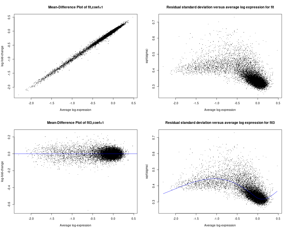
I see no evidence of any serious problems that would cause limma not to work on your data. Your data does not look very good quality, with all almost all the values clustered around 0 with a tail of negative values. But that is not an issue with limma or the statistical tests.
Thx a lot for the confirmation, Dr. Smyth! That is a great news! Appreciated very much!
my data is genecoverage , calculated in percenatges. i ran vst and got my batch corrected values in range of -6 to 7 (approx) how come i got negative values?
and the genes that got 100 % covered are now said to be just 6 % covered... please comment
below is the code that i have used
Install and load required packages
install.packages(c("limma", "edgeR", "ggplot2"))
library(limma) library(edgeR) library(ggplot2)
Load data
genecov <- read.csv("C:/Users/coverage/10geq_gene_coverage.csv", row.names = 1) batch_info <- read.csv("C:/Users/batch_info.csv", row.names = 1)
Set paths for batch-corrected counts file
batch_corrected_cov_file <- "C:/Users/coverage/batch_corrected_cov.csv"
Check the structure of the data
head(genecov) head(batch_info)
Create a design matrix
design_matrix <- model.matrix(~ condition, data = batch_info)
Convert genecov to a DGEList object from edgeR
dge <- DGEList(counts = as.matrix(genecov))
Add batch information to the DGEList object
dge$samples$Batch <- batch_info$Batch
Apply VST and perform batch effect correction using limma
vst_dge <- voom(dge, design = design_matrix, plot = FALSE) vst_dge <- removeBatchEffect(vst_dge, batch = vst_dge$samples$Batch, design = design_matrix)
Save batch-corrected counts to a file
write.csv(vst_dge, file = batch_corrected_cov_file)
have i missed something or overlooked ??
hi again.
I tried again with arcsine method. the range of data was now 0-1.5 so, I did back transformation and got the figure below. The percentage range are now almost much improved.
it ran successfully though I got a warning stating that I have some got NaN values. I traced back to see if these NaN values are 0 values in original data but then, the values are varying like 26 or 50 or more than that.... How should I proceed further with such values. Also, in my plot the genes highest coverage percentage was 100 earlier. Batch effect was removed, then the percentage drops to max 89.9 %
Will that be correct to state that now the highest percentage of gene coverage is 90% approx. and not 100% Does not it affect my biological inference then, that earlier I was getting all the nucleotides mapped by our reads in a particular sample and now 90% of the nucleotides (or total length) is covered.
Please comment
these are the codes i used
Install and load required packages install.packages(c("limma", "edgeR", "ggplot2")) library(limma)
library(edgeR)
library(ggplot2)
Load data
percentage_data <- read.csv("C:/Users/coverage/10geq_gene_coverage.csv", row.names = 1)
batch_info <- read.csv("C:/Users/batch_info.csv", row.names = 1)
write.csv(back_transformed_data * 100, file = "C:/Users/coverage/back_transformed_data.csv")
Set paths for batch-corrected counts file
batch_corrected_cov_file <- "C:/Users/coverage/batch_corrected_cov.csv"
batch_corrected_plot <- "C:/Users/coverage/batch_corrected_boxplot.png"
Check the structure of the data
head(percentage_data)
head(batch_info)
Arcsine square root transformation
sqrt_transformed_data <- asin(sqrt(percentage_data / 100))
Create a design matrix
design_matrix <- model.matrix(~ condition, data = batch_info)
Convert transformed data to a DGEList object from edgeR
dge <- DGEList(counts = sqrt_transformed_data)
Add batch information to the DGEList object
dge$samples$Batch <- batch_info$Batch
Perform batch effect correction using limma
vst_dge <- removeBatchEffect(dge, batch = dge$samples$Batch, design = design_matrix)
Save batch-corrected counts to a file
write.csv(vst_dge, file = batch_corrected_counts_file)
Back-transform the data with handling for edge cases
back_transformed_data <- sin(sqrt(asin(vst_dge)))^2
Visualization before and after batch correction
par(mfrow = c(1, 2))
boxplot(percentage_data, main = "Original Data", ylim = c(0, 100))
boxplot(back_transformed_data * 100, main = "Batch-Corrected Data", ylim = c(0, 100))