Hi,
I'm using Splatter to generate single-cell simulated data.
I'm using these parameters:
###generate single-cell simulated object
K=5### number of Cell types
Ng=10 ###number of genes
Ns=20###number of samples
vcf <- mockVCF(n.samples = Ns)
gff <- mockGFF(n.genes = Ng)
params.group <- newSplatPopParams(batchCells =100,#Number of cells in each batch.
                                  similarity.scale =1,
                                  de.downProb = c(0.1, 0.4, 0.3, 0.6, 0.5),
                                  de.prob = c(0.3, 0.1, 0.2, 0.01, 0.4),
                                  de.facLoc = c(0.6, 5, 0.1, 0.01, 2),
                                  de.facScale = c(0.1, 0.4, 2, 0.5, 0.4),
                                  group.prob = rep(1/K,K),
                               )
sim.means <- splatPopSimulateMeans(vcf = vcf, gff = gff,
                                   params = params.group)
sim.sc.gr <- splatPopSimulateSC(params=params.group,
                                key = sim.means$key,
                                sim.means=sim.means$means,
                                sparsify = FALSE)

sce= sim.sc.gr
sce=logNormCounts(sce)
SCcount=assays(sce)$logcounts
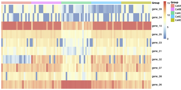
Then you can see the heatmap of the normalized count matrix (SCcount) in figure 1.

Then I aggregated the SCcount matrix across cluster-sample groups.
###Aggregate count matrix across cluster-sample groups
pb <- aggregate.Matrix(t(assays(sce)$logcounts),
                       groupings = groups, fun = "mean")

annot_cols = data.frame(
  Group = rep(apply(expand.grid(c("CellA","CellB",'CellC',"CellD","CellE")), 1, paste, collapse="."), each=Ns),
  row.names = colnames(t(pb))
)
g=pheatmap::pheatmap(t(pb),annotation_col = annot_cols,cluster_rows = F,cluster_cols = F,show_colnames = F)
ggsave(g,file=paste(path,'sample-Celltypeheatmap.pdf',sep=""),width = 30,height = 10,limitsize = FALSE)
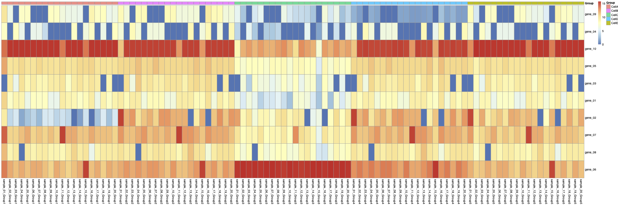
you can see the aggregated Sample-Celltype matrix in figure 2:

Then, from the aggregated Sample-Celltype matrix, I made another matrix to show gene expression levels in each CellType across all samples like:
###gene expression levels in each CellType across all samples
gen=c(7,9,4,10,3,1,2,8,5,6)
cellg=matrix(c(as.matrix(pb)),nrow=Ng*K,ncol=Ns,byrow=TRUE)

rownames(cellg)=apply(expand.grid(c(paste('celltype',LETTERS[1:K],sep='')),c(paste('g',gen,sep = ''))), 1, paste, collapse=".")
colnames(cellg)=apply(expand.grid(c(paste('S',1:Ns,sep = ''))), 1, paste, collapse=".")


annot_rows= data.frame(
  Group = rep(apply(expand.grid(c(paste('g',gen,sep = ''))), 1, paste, collapse="."), each=5),
  row.names = rownames(cellg)
)
g=pheatmap::pheatmap(cellg,cluster_rows = F,cluster_cols = F,fontsize = 10,annotation_row =annot_rows,show_rownames = F )
ggsave(g,file=paste(path,'cellgheatmap.pdf',sep=''),width = 10,height = 5,limitsize = FALSE)
you can see the heatmap of the cellg matrix in figure 3:

Then I calculate the correlation between rows of Matric cells.
###correlation between each rows of cellg matrix
mm=data.frame(t(cellg))
cor(mm)
g= pheatmap::pheatmap(cor(mm),cluster_rows = F,cluster_cols = F,display_numbers = F,fontsize = 20)
ggsave(g,file=paste(path,"Corelation.pdf",sep=""),dpi = 1000,width = 50,height = 50,limitsize = FALSE)
you can see the heatmap of this correlation in figure 4.

Now I have some questions:
In figure 3, we can see an unknown structure (the blue blocks). It seems some genes are off in all of the cell types. This leads to a high correlation between rows of the matrix cellg (As you can see in figure 4).
1- How can I get rid of the blue and red blocks in figure 3 and also the red blocks in the Correlation matrix (figure4). 2- How are samples generated in the Splatter object? 3-Is it a multiplicative factor to create the samples? Is each sample just a multiplicative version of all the others?
I appreciate your help.

