Entering edit mode
Would someone knows how to plot individual graphs from the different cluster generated?
Currently, I'm running the following code:
see.genes(get_groups$sig.genes$XxxvsMock, show.fit = T, dis =AX_design$dis,
                cluster.method="hclust", cluster.data = 1, k = 9)
From that, I'm getting, obviously, 9 graphs, but, unfortunately, grouped all together. I would like to see each graph separately. Right now I can't see the legends of each graph, because they are kind of overlapping each other, which is making them all really lame and not useful for presentation or publication.
This is an example of the overlapped plots:
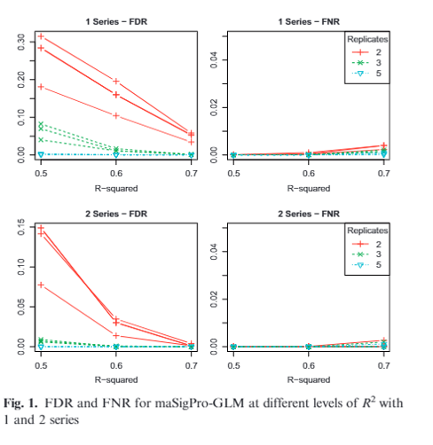
This is an example from maSigPro paper which is also what would like to get:
Thanks in advance for any help!


