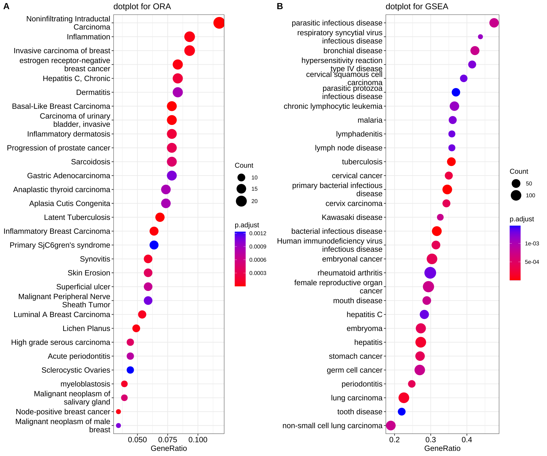
I have a very specific question regarding the dotplot function from enrichplot:
Example data from enrichplot tutorial
library(DOSE)
library(enrichplot)

data(geneList)

de <- names(geneList)[abs(geneList) > 2]

edo <- enrichDGN(de)
edo2 <- gseDO(geneList)

dotplot(edo, showCategory=30) + ggtitle("dotplot for ORA")
dotplot(edo2, showCategory=30) + ggtitle("dotplot for GSEA")
I want to compare two different dotplots, but what bothers me is that the Size of the Dots is according to the counts. In this example a big dot on plot A means 20 counts, but on plot B 100 counts. This makes it harder to be comparable. In my real dataset I want to compare GO terms for up and down regulated genes for a given analysis of two timepoints (day 1 vs day 5), but the size of the dots makes it hard to compare. I want to the scaling of the dotsize to be the same for both plots. it does not matter if one has fewer terms than the other, then the dots will be scaled accordingly. Is there maybe a way to change the dotsize to be according to a given maximum (e.g. the dotsize of B or whatever I would like specifiy?)
Thank you very much for your help!
edit: made my point clearer


Comparing the number of genes of the two algorithms(ORA and GSEA) does not make sense. They represent different meanings, one is the number of intersections between the input genes and the term genes, and the other is the number of core-enriched genes.
Maybe it was not clear from my explanation. These dotplots are just examples from the website to make my point. In my analysis I basically want to compare GO up and GO down for a given comparison of two timepoints (day 1 vs day 5). And one has more GO terms, therefore the dotsize for the counts is different. But I want to have the scaling of the dotsize the same for both.