
I have a very simple question, which I couldn't find an answer after surfing the web. I'd appreciate if someone can link the answer, if it's already there.
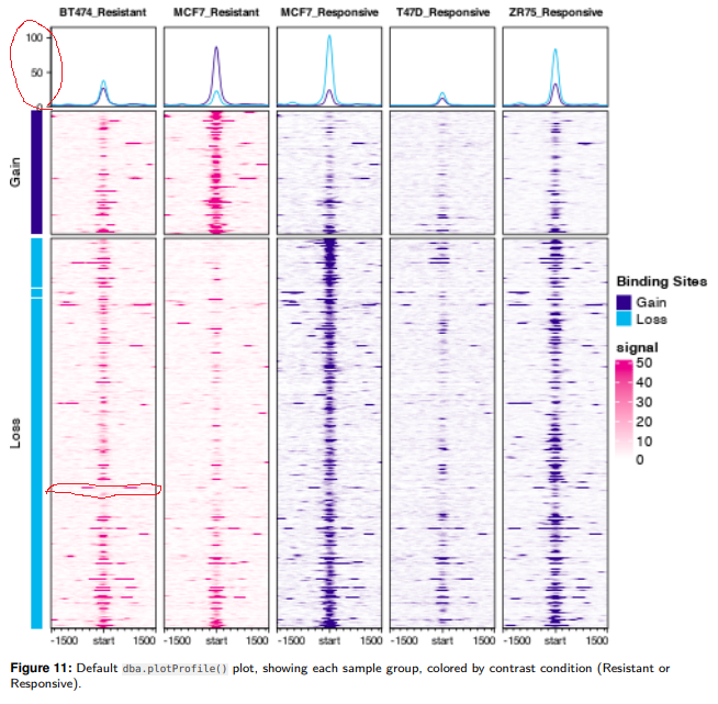
After successfully generating plot.profile, I found that the y-axis in the graph doesn't have any description (Red circle at the top). If I report dba object used for the plot.profile (thatis, dba.report(dbaobject)), there are numeric values for each genotype/cell type. But what are they? Read counts? Scores?
Also, can I extract values of heatmap or I can mark gene names of certain heat map lines? For example, in the red circle on the BT474_Reistant heat map, I want to know which gene/locus it is by extracting the eigen value of heatmap or can I somehow label that specific heatmap element (the circled one)? I think this is related to profileplyr, but no luck to find a way to mark individual element.
Thank you in advance.

Thanks Rory for all your help always.