Entering edit mode

Hi all, I'm currently using DESeq2 (version 1.38.3) for my analysis and encountered a dispersion plot that appears quite different from the typical dispersion plot presented in the DESeq tutorial. The plot I obtained looks like this:
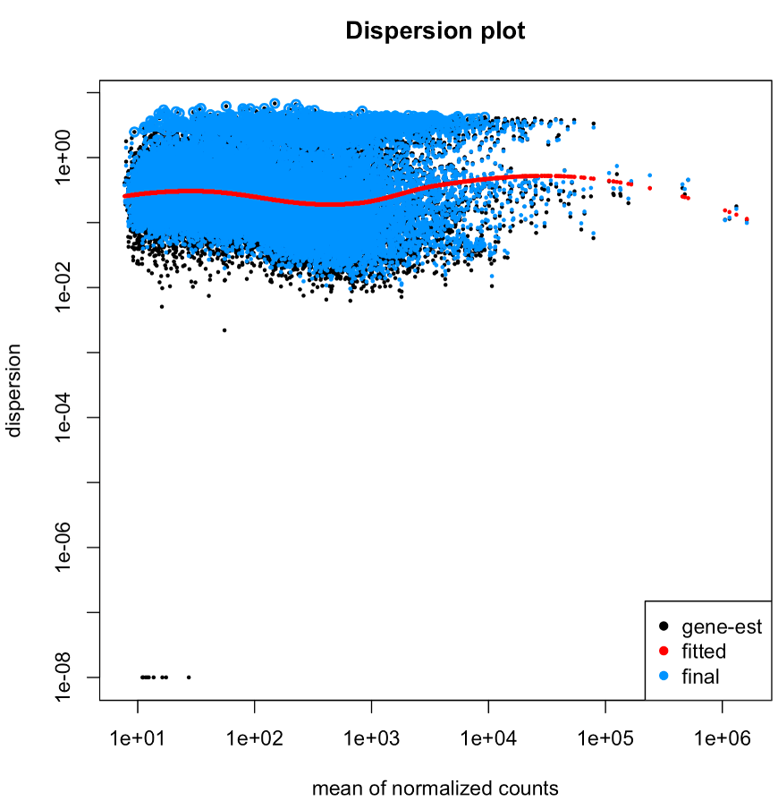
I would greatly appreciate any insights or explanations as to why it appears this way. Here are some additional details that might be relevant: I have two different groups, each consisting of 11 individuals. After RNAseq, I used Trinity for assembly and Salmon for obtaining expression read counts. The quant.sf files were loaded in via tximport.
Thank you in advanced!
R code:
dirs <- list.files("first_batch/first_batch_salmon_trinity_full/", "Sample")
files <- file.path("first_batch/first_batch_salmon_trinity_full/", dirs, "quant.sf")
names(files) <- dirs

######### gene level
tx2gene <- read_delim(file.path("first_batch/first_batch_salmon_trinity_full/",
                                "Trinity.fasta.gene_trans_map"),
                      col_names = FALSE) %>%
    dplyr::select(X2, X1)
names(tx2gene) <- c("transcript_IDs", "gene_IDs")
txi.salmon.g <- tximport(files, type = "salmon", tx2gene=tx2gene)

######### meta information
samples <- read_delim("first_batch/meta.txt", col_names = FALSE) %>%
    dplyr::select(c(2, 3, 4))
names(samples) <- c('sampleID', 'color', 'sex')
samples_reorder <- samples[match(dirs, samples$sampleID), ]
samples_reorder$color <- factor(samples_reorder$color)
samples_reorder$color <- relevel(samples_reorder$color, ref = 'B')

all(samples_reorder$sampleID == colnames(txi.salmon.g$counts))

dds_g <- DESeqDataSetFromTximport(txi.salmon.g, samples_reorder, ~color)
keep <- rowSums(counts(dds_g) >= 10 ) >= 11
dds_g <- dds_g[keep,]
dds_g <- DESeq(dds_g)
plotDispEsts(dds_g, main="Dispersion plot")
