
I am trying to generate some visualisations for my enrichment analysis following this tutorial and I realised that the barplot function (from enrichplot package) that takes this type of data (enrichResult) does not plot a right scale according to the p-adjusted value.
Assuming that myEnrichResult was generated using the enrichGO() function:
myEnrichResult<- enrichGO(gene = EntrezIDlist,
                    OrgDb     = org.Mm.eg.db,
                    ont           = "CC",
                    pAdjustMethod = "BH",
                    pvalueCutoff  = 0.05)
myEnrichResult <- simplify(myEnrichResult)
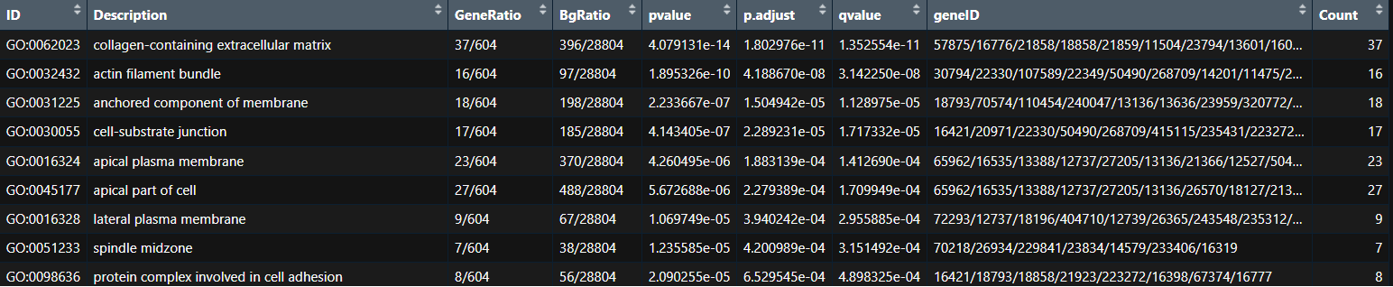
I try to generate the following barplot:
p <- barplot(myEnrichResult,
        showCategory = 10, cluster = "hierarchical", color="p.adjust",
        x = "Count")
p <- p + labs(x = "Number of genes", title = "Enrichplot Package")
p
If you compare the order of the terms from the 1st image (table) with the plot, the first term (the most significant -collagen-containing extracellular matrix- with a padj = 0.00000000001802976) is coloured in red. But this number is smaller than 6e-04 (0.0006) and it should be coloured as blue. Same happens with the following terms till cell-substrate junction (padj = 0.0002279389) that is smaller than 0.0002 and it should between red and blue)
On the other hand, if I don't follow the barplot function (from enrichplot package) and I use ggplot2 to generate a similar plot, this scale is better plotted and the terms are plotted as they should according to the padjust values.
DF_myEnrichResult <- as.data.frame(myEnrichResult)

# Sort the dataframe by padj value ---> same result as the table shown as a picture above
data_sorted <- DF_myEnrichResult[order(-DF_myEnrichResult$p.adjust, decreasing = T), ]

# Take the top N enriched terms
top_terms <- head(data_sorted, 10)

# Define color gradient based on adjusted p-value
color_scale <- scale_fill_gradient(low = "blue", high = "red")

# Create the barplot using ggplot2 with a border around the plot panel
  p <- ggplot(top_terms, aes(x = Count, y = Description, fill = qvalue)) +
  geom_bar(stat = "identity") +
  labs(x = "Gene Count", y = "GO Terms", title = "Top Enriched GO Terms", fill="p.adjust") +
  color_scale + # color gradient based on qvalue
  theme_bw() + # white background
  theme(panel.border = element_rect(color = "black", fill = NA, linewidth  = 0.5),  # Add border around the plot panel
        axis.text.y = element_text(family = "sans", color = "black", size = 12),  # Set font and size for y-axis
        axis.text.x = element_text(family = "sans", color = "black", size = 12), # Set font and size for x-axis
        axis.title = element_text(family = "sans", color = "black", size = 12),  # Set font and size for axis titles
        plot.title = element_text(family = "sans", color = "black", size = 12), # Set font and size for title
        )

# Insert line breaks in descriptions (long terms will be written in 2 lines)
p <- p + scale_y_discrete(labels = function(x) stringr::str_wrap(x, width = 40))  # Adjust the width as needed
p
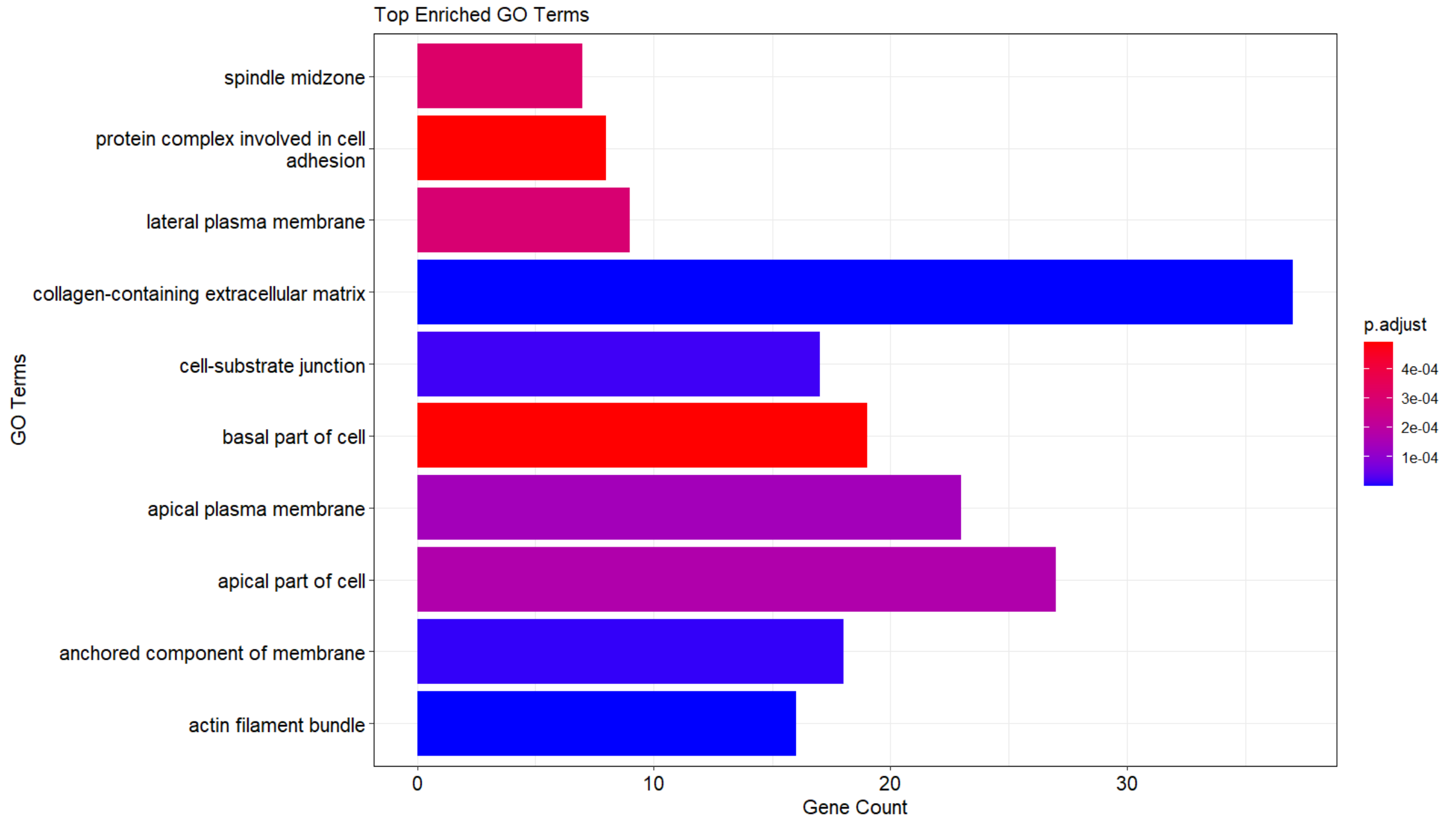
If we focus on 2 terms and check their colours, the previous that I mentioned:
collagen-containing extracellular matrix, padj = 4.079131e-14.
as.numeric(format(1.802976e-11, scientific=FALSE)) > 0.0001 ---> FALSE
as.numeric(format(1.802976e-11, scientific=FALSE)) < 0.0001 ---> TRUE
--> as it smaller than 0.0001, it should be plotted as blue (as it appears)
apical plasma membrane, padj = 1.883139e-04.
as.numeric(format(1.883139e-04, scientific=FALSE)) > 0.0001 ---> TRUE
as.numeric(format(1.883139e-04, scientific=FALSE)) < 0.0004 ---> TRUE
as.numeric(format(1.883139e-04, scientific=FALSE)) > 0.0004 ---> FALSE
--> it is bigger than 0.0001 (blue) and smaller than 0.0004 (red), therefore it should appear between blue-red (as it appears, as violet).
Does anybody check this scale before and/or had the same problem with clusterProfiler / enrichplot ? I am wondering if it something that I am doing wrong (a missing argument, preprocessing step...) or if it is more a problem from the code that needs to be adressed.
Thanks in advance!

Oh god, it is right, how I didn't realise before. I got confused with the scientific format of the numbers and I was in a loop for nothing. Thanks very much