FilterByExpr low counts with small sample size
1
0
Entering edit mode
Jonathan ▴ 10
@c31cf0e5
Last seen 5 days ago
United States

I have 160 samples for a bulk-RNASeq project; 138 are of condition "X" that I (currently) don't care about, and the remaining 22 are of the investigated condition "Y" that is of interest. Condition "Y" has 6 subgroups (A-F), which are very small, 2-7 samples each, and I want to compare them.

Thus, I've created a model matrix of each subgroup (using the formula: ~0 + subgroup), and each has the following number of samples:

X Y_A Y_B Y_C Y_D Y_E Y_F
138 7 4 3 3 3 2

_

Samples from condition "X" were kept for analysis as was suggested here.

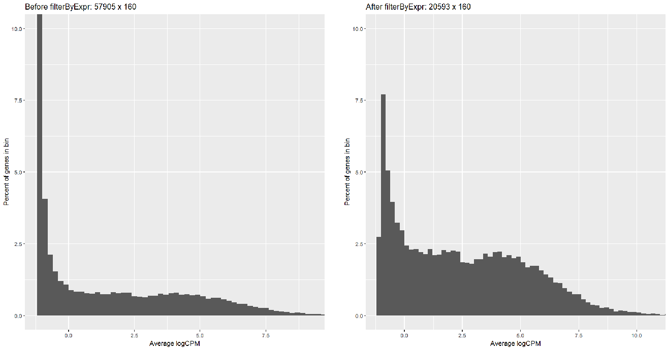
Running FilterByExpr filtered most of the symbols (57905 => 20593) but with too many low-reads; I can tell this by creating a histogram: Ave Log CPM before and after filterByExpr

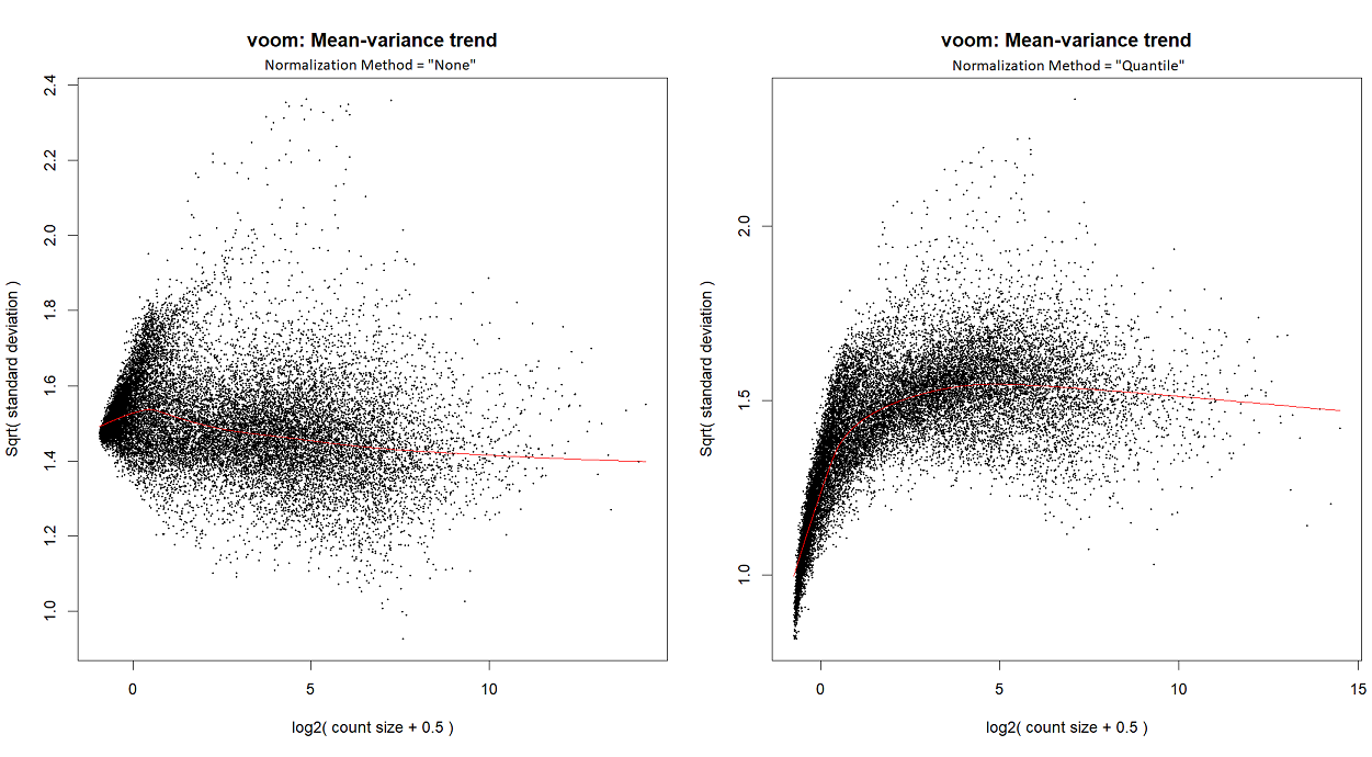
...or by looking at the voom plot, which looks... hideous:

Voom plots

So,

  • Did I do something wrong?
  • Should I change the FilterByExpr parameters?
  • Should I filter differently, e.g., by taking some minimal AveLogCPM from the entire cohort?
    • Or only genes that pass a certain AveLogCPM from BOTH X and from Y?
    • Or perhaps genes that AveLogCPM pass each of the 7 subgroups independently?

Any suggestion is welcomed!

edgeR • 381 views
ADD COMMENT
0
Entering edit mode

Are you running voom or voomLmFit? Did you run normLibSizes() in edgeR prior to voom? Are you starting with counts?

ADD REPLY
0
Entering edit mode

Usually I run voomLmFit, although in order to create the mean-variance trend plots for this particular post, I ran voom; I've checked - they both yield a similar plot.

I'm starting with counts (in the following snippet, exprs.mat holds counts), and I run calcNormFactors instead of normLibSizes. My code is as follows:

design.mat<-model.matrix(~0 + subgroup, data=pdata.df)
DGE<-DGEList(counts = exprs.mat, samples = pdata.df) %>% calcNormFactors()
keep.expr = filterByExpr(DGE, design = design.mat)
DGE.filter = DGE[keep.expr, , keep.lib.sizes = F] %>% calcNormFactors()
voomLmFit(counts = DGE.filter, design = design.mat, block = pdata.df$PatientID, plot = T, normalize.method = "none")

For quantile normalization, I don't use TMM (as explained here), so the last line is

voomLmFit(counts = exprs.mat[keep.expr, ], design = design.mat, block = pdata.df$PatientID, plot = T, normalize.method = "quantile")
ADD REPLY
3
Entering edit mode
@gordon-smyth
Last seen 1 hour ago
WEHI, Melbourne, Australia

It doesn't seem to me that there is necessarily any problem with the analysis.

You say that there are "too many low-reads" but actually there is no requirement to avoid low counts in a limma analysis, especially if you use voomLmFit().

You say the voom plot looks "hideous" but the plot using the standard recommended pipeline with TMM normalization looks just fine. Quantile normalization has caused a J-shaped voom trend. If you don't like that, then why use quantile normalization? But I imagine the limma analysis will still work ok even with the J-shaped voom trend.

Regarding the larger question of condition "X", I would include "X" in the analysis only if the "X" samples are similar to the "Y" samples, and they were sequenced at the same time and you plan to make comparison between "X" and "Y" at some future stage of the project.

I don't see any need to change the filtering. I would not recommend filtering on AveLogCPM.

ADD COMMENT
0
Entering edit mode

Thank you for your answer; However, I have some follow-up questions.

Following up in In your 1-2-3 article, you say that

"... the voom-plot provides a visual check on the level of filtering performed upstream. If filtering of lowly-expressed genes is insufficient, a drop in variance levels can be observed at the low end of the expression scale due to very small counts. If this is observed, one should return to the earlier filtering step and increase the expression threshold applied to the dataset."

Also, in this (dated?) post, you said that

"Ideally the trend line should be monotonically decreasing. If it goes sharply up before trending down, then you haven't filtered enough"

Technically, both my Voom plots show a drop in variance levels on the low end (TMM less than Quantile).

Additionally, my filtered log-cpm plot does not have this nice "single-peak" (figure 1B in 1-2-3) and still keeps the bimodal distribution (akin to Figure 1A in 1-2-3).

So, my questions are about how can one be sure that we filtered "enough" genes? Is filterByExpr a "fail-safe" method? Should I employ another metric to determine "proper" filtering (maybe by running plotSA)?

ADD REPLY
1
Entering edit mode

There are some unusual aspects to your dataset.

The first is that there is an extreme imbalance between the sample sizes for the different groups. This imbalance already makes it inevitable that you must keep many low counts in the analysis. There is just no way around that. The filtering has to keep genes that are expressed in a few as 2 samples, otherwise you risking losing genes that are specifically expressed in the Y_F subgroup. You cannot filter on aveLogCPM as you have proposed, because such filtering would be determined almost entirely by the X samples and you would lose any gene that is expressed in Y but not in X. filtering on aveLogCPM each of the 7 subgroups independently would contravene the independent filtering rule and would fail to control the FDR. On the other hand, filterByExpr() has done exactly what is necessary, keeping genes with a decent expression level in two or more samples.

You say that you have included X in the analysis because of advice I gave in an earlier thread, but you have taken my advice somewhat out of context. I advised the earlier poster not to remove groups that were already part of the dataset and were already included in the original analysis. I didn't advise them to add unrelated samples to the analysis. As I've said above, I would include X in your analysis only if they are closely related samples and if you do intend to include X in the DE comparisons at a future stage of the study.

A second curiosity is that the voom variance trends for your data look unusually flat without the strong decreasing trend that is usually characteristic of bulk RNA-seq data. I haven't seen this before so I don't know what has caused it, but it seems to be a characteristic of your data and the experimental design, perhaps something to do with how the counts were formed. It is not something that can be fixed by increasing the filtering.

Thirdly, there is a flare-up or cluster of genes on the left of the mean-variance plot where the genes have large variances and the mean-variance trend is sharply increasing and doesn't follow the main trend. I am refering to genes with x-values from 0 to about 1.5 and y-values from 1.5 to 1.8. This could be caused by a batch effect, or perhaps genes that have just one value in the smaller groups, or perhaps ambiguously assigned reads. If I was analyzing this data, I would be investigating the identity of those genes. But it is something you might just have to live with. Just throwing those genes out of the analysis is probably not the best.

It's a pity that you've chosen not to show the mean-variance trends from voomLmFit(), because voomLmFit() is specifically designed to alleviate the effects of zero counts and the resulting mean-variance curves must be better than those from voom(), even if only slightly. It is a pity to have to comment on plots that are not the definitive ones.

My intention is that you should simply use filterByExpr() with preset arguments and not try fiddling with it, unless you really know what you're doing. Nothing is "fail-safe", but the function seems to have done the best that can be done even for your quite unusual dataset.

In your 1-2-3 article, you say that "... the voom-plot provides a visual check on the level of filtering performed upstream ..."

This quote predates both voomLmFit and filterByExpr, as can be seen from the first version of the article ( https://f1000research.com/articles/5-1408/v1 ). I introduced the filterByExpr function specifically to combat the confusion that people seemed to have with this advice. It is still true that viewing the mean-variance relationship is a useful diagnostic.

Also, in this (dated?) post, you said that ""Ideally the trend line should be monotonically decreasing. If it goes sharply up before trending down, then you haven't filtered enough"

This quote wasn't referring to voom() or RNA-seq.

Technically, both my Voom plots show a drop in variance levels on the low end (TMM less than Quantile).

Please take a deep breath and look at the TMM plot again. The quantile mean-variance trend does show the sort of J-shape that the above quotes were referring to, but the TMM plot does not. The mean-variance trend in the left plot shows a generally smoothly decreasing trend, although one with a very shallow slope. There is a slight bump on the far left of the plot, caused by the flare-up that I referred to above, but the left-most value of the trend line remains above the trend line for all x-values > 2.5. This is nothing like the "sharply up" trend being referred to above.

my filtered log-cpm plot does not have this nice "single-peak" (figure 1B in 1-2-3) and still keeps the bimodal distribution (akin to Figure 1A in 1-2-3).

The density plot was shown in the workflow paper only for expository purposes. It was not intended to a quality metric and there is no similar plot in the limma or edgeR User's Guides. As discussed above, you will have to tolerate small counts in your study because of the experimental design.

ADD REPLY
0
Entering edit mode

Thank you again for your thorough explanation; This clarified a lot for me, and I'll proceed with your recommendations.

For completeness, I've added the mean-variance trends from voomLmFit, which appear (almost?) identical.

voomLmFit plots

ADD REPLY

Login before adding your answer.

Traffic: 803 users visited in the last hour
Help About
FAQ
Access RSS
API
Stats

Use of this site constitutes acceptance of our User Agreement and Privacy Policy.

Powered by the version 2.3.6