Entering edit mode

Hi there,
I performed GSEA with a genelist with logFC in clusterProfiler, and get my results with gsea_FS_res <- gsea_FS@result. Does a negativae NES means down-regulation of the pathway? Is there an easier way to visualize up/down regulated pathways? The default dotplot ( dotplot(gsea_FS, showCategory=30)) doesn't distinguish up or down regulated ones.
Thanks a lot!
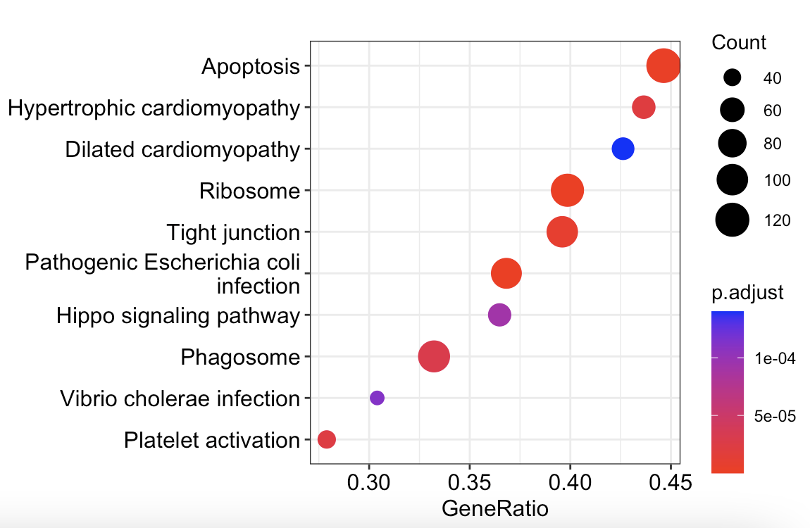
> head (gsea_FS_res)
               ID                           Description setSize enrichmentScore       NES       pvalue
map03010 map03010                              Ribosome     281      -0.5901190 -2.322865 1.804294e-19
map05130 map05130 Pathogenic Escherichia coli infection     258      -0.4969210 -1.944116 1.082702e-09
map04210 map04210                             Apoptosis     280      -0.4723868 -1.857159 1.702207e-08
map04530 map04530                        Tight junction     250      -0.4778038 -1.866592 1.009105e-07
map05410 map05410           Hypertrophic cardiomyopathy     126      -0.5458584 -1.978388 3.081426e-07
map04611 map04611                   Platelet activation     147      -0.5219942 -1.921965 4.325275e-07
             p.adjust       qvalue rank                   leading_edge
map03010 6.044386e-17 4.273329e-17 4133 tags=40%, list=16%, signal=34%
map05130 1.813526e-07 1.282147e-07 4234 tags=37%, list=17%, signal=31%
map04210 1.900798e-06 1.343848e-06 5284 tags=45%, list=21%, signal=36%
map04530 8.451253e-06 5.974963e-06 5284 tags=40%, list=21%, signal=32%
map05410 2.064556e-05 1.459623e-05 4824 tags=44%, list=19%, signal=36%
map04611 2.414945e-05 1.707345e-05 2797 tags=28%, list=11%, signal=25%
Filter the dataframe for positive and negative enrichmentScore and make two separate plots, or a facet_wrap, many options here.
Try
an example is also presented in https://pubmed.ncbi.nlm.nih.gov/34557778/.