I had a quick question about using ellipses in PCAtools on bulk RNA-seq data. On my data, I can make a plot using the code below:
biplot(p,
       lab = NULL,
       legendPosition = 'right',
       colby = 'genotype',
       colLegendTitle = 'Genotype',
# ellipse config
      ellipse = TRUE,
      ellipseLevel = 0.95,
      ellipseFill = TRUE,
      ellipseAlpha = 1/4,
      ellipseLineSize = 0)
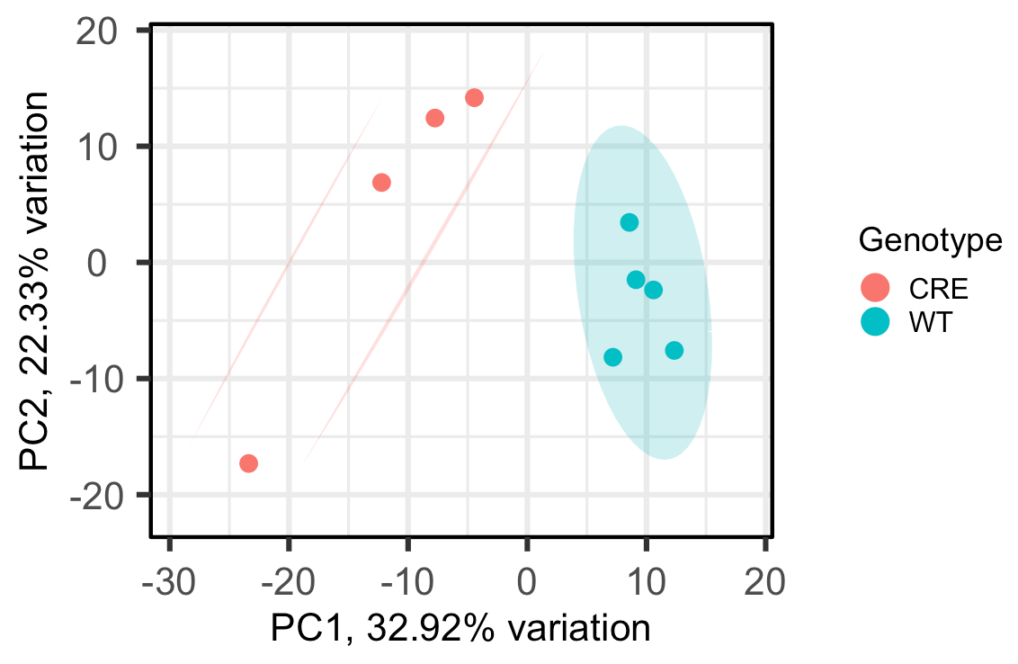
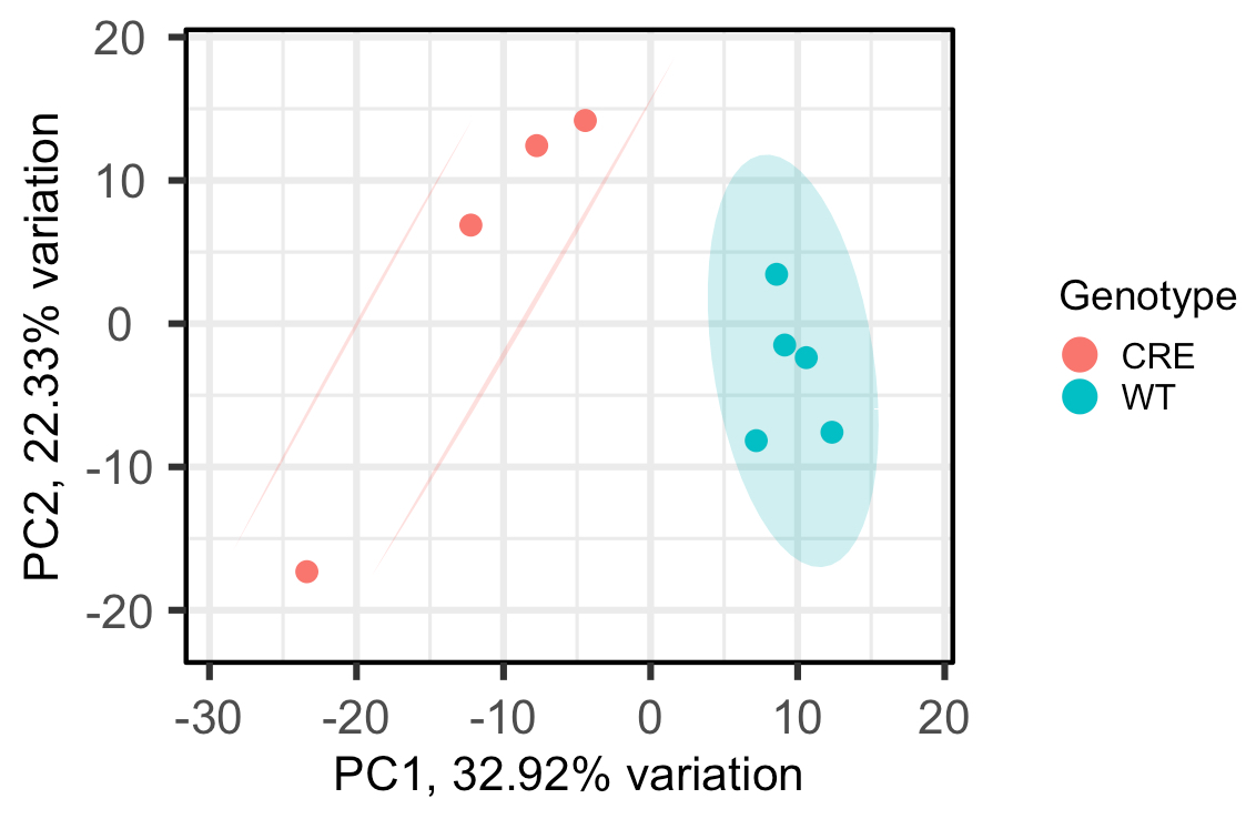
As you can see, the WT group is circled and the CRE group has 2 lines drawn around it, rather than another circle, which I'm not sure how to interpret. Does this mean, that at the 95% confidence level, the CRE group isn't really one group?
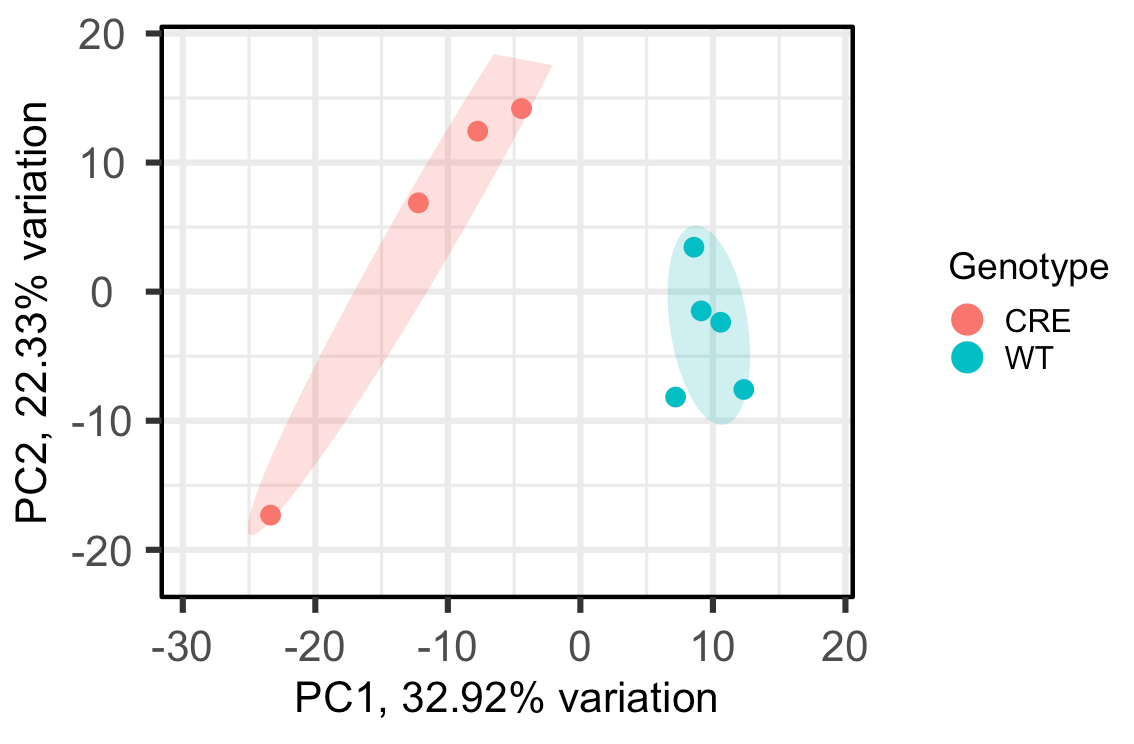
For example, when I change ellipseLevel = 0.75, here's the output:
Since now all the points in the CRE group fall under the same circle, can I interpret that as I can be 75% confident all the CRE samples are statistically similar, or something like that? Just want to make sure I'm interpreting this correctly. Thank you!


Hi there!
Is there a way to do it with less than 4 samples?
I have 3 sample in two groups and I would like to do the same analysis. When I use this, I receive the message "Too few points to calculate an ellipse.
Does someone have suggestion how to do it?
Thank you!