Entering edit mode

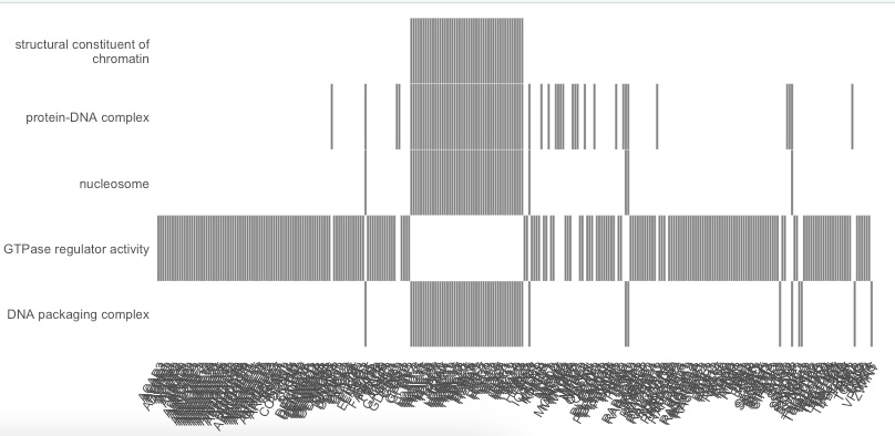
I would like to limit the number of displayed genes (so not the categories, which is easily done with showCategory) in the enrichplot heatplot, but have not found a way to do it. I am running the gseGO Function to get my enriched gene sets and then passing that to heatplot. I don't want to limit the number of genes before the gse analysis itself and I also don't want to change the number of the maxGeneSetSize, but would like to only limit the heatplot to the top n (for example 10) genes per gene set to be plotted. If I plot it as it is now, it is impossible to read any of the gene names, because there are just way too many per set.
gse <- gseGO(geneList=gene_list,
ont ="ALL",
keyType = "ENSEMBL",
pvalueCutoff = config_pvalueCutoff,
verbose = TRUE,
OrgDb = organism)

readable_gene_names <- setReadable(gse, 'org.Hs.eg.db', 'ENSEMBL')
heatplot(readable_gene_names, foldChange=gene_list, showCategory=5)

sessionInfo( )

R version 4.2.2 (2022-10-31)
Platform: x86_64-apple-darwin17.0 (64-bit)
Running under: macOS Monterey 12.6.2
You asked a rather straightforward question, but in my opinion the answer is less straightforward...
Let me start by saying that from a 'technical' perspective it is indeed possible to limit the number of genes that should be plotted'. To do that you have to limit the core enrichment genes present in results object. See code below in which I apply a small 'hack' to replace for each GO category the full set of core enrichment genes in the
core_enrichmentcolumn of thegseaResultobject by 5 randomly selected core enrichment genes present in that category. These 5 randomly selected genes are then plotted.The difficult question is: which genes would you like to show in the heatplot? In other words, how exactly will you define which of the core enriched genes to show, and which ones not? The nice thing of the heatplot is that is shows the overlap of core enriched genes between the GO categories. However, if you, for example, select only 5 random genes, the information on genes present in multiple gene sets is lost. This may dramatically affect the interpretation of the results... (which also becomes apparent when comparing the heatplots below).
Just my 2 cents....
Hi Guido,
thank you so much for taking the time to look into this and your proposed solution (Sorry it took me a bit to reply)! I see the issue with actually selecting the relevant genes to display from each set. I am still pretty new with this stuff (trying to figure it out for my master thesis), so am I understanding correctly that within each core enrichment set the result object does not actually have any ordering of how much each of the genes in the set contributes to the set? I was thinking if there was such an order, then I could select the top 5 contributing genes to that gene set. Maybe taking aside how this is kind of a hacky solution, how do people usually deal with this issue? Is the heatmap plot only meant for much smaller list of input genes? I would assume a lot of people would run into a similar issue.
Thank you so much!
AFAIK the core-enriched genes are indeed ordered based on their ranking metric.
In other words, the first gene listed is the one belonging to the gene set tested that is most at the top (or bottom) of the ranked input list. So if you would select the first 5 genes, then these would correspond to the 5 most changed genes (based on the ranking metric).
For fine-tuning of the heatplot you should realize 2 things;
the function
heatplothas an argument calledlabel_format(default = 30) that sets the space used for plotting the descriptions of the GO categories. Lowering this number generates more space for plotting the genesin essence a
ggplot2-based graph is generated when executing the functionheatplot. You can thus use theggplot2syntax to modify the heatplot. Below some code to get you inspired.Lastly, I noticed you used the argument
ont ="ALL"when callinggseGO. You could also consider limiting the GO categories to BP, MF or CC separately.Code using the unmodified output from
gseGO, and reducing the space for plotting the description of the GO categories to 15:Thank you for the explanation! I was having the same problem except I am using heatplot for KEGG analysis, the thing is while I am trying to use size >5 I get error like the following, could you please explain what might be the problem and how to fix it?
thank you in advance!
Regards,
Ruba
it worked again.