
Hello all,
I'm pretty new to R and PCA analyses, and my datasets are normally too small for any meaningful statistics, but I need to conduct a PCA in R for a paper I'm writing. I'm using the pcaMethods package (method=ppca) because my dataset has a lot of non-random missing data and chatGPT told me this was the best package to use for that. I'm having trouble understanding how to evaluate the effectiveness of my PCA, however. I've found documentation of how to evaluate the amount of variance that's described by each component using a screeplot, but that doesn't seem to be compatible with pcaMethods. Any advice on how to visualize the effectiveness of the PCA I would appreciate (again, I'm a novice at both R and stats).
But also, I have produced a biplot from my PCA and I'm confused why there are secondary x and y-axes that are in a different scale than my primary x and y-axis. I've included a picture below to illustrate. I've looked in a paper published under my advisor several years ago and the PCA performed there looks like a standard scatter plot with one x and one y axis. Any idea why mine is generating these secondary axes and can I get rid of them?
Thanks!
pca_result <- pca(data_matrix, method = "ppca", nPcs = 3)
biplot(pca_result, choices = c(1, 2), main = "Biplot of PC1 and PC2")
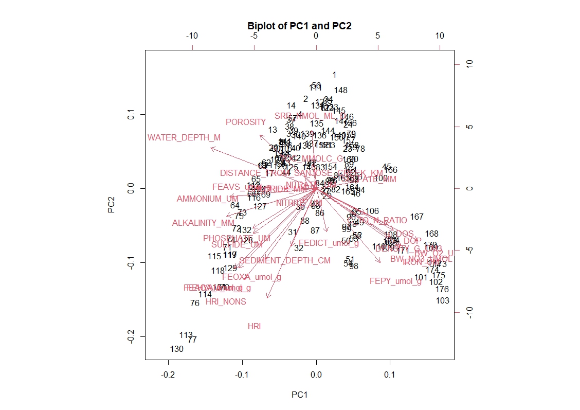

Thank you. So one axis is for the points, which I assume those numbers correspond to each row and the other corresponds to the variables. From what I gather the values for the "loadings" is equivalent to the variable names on this graph. Is there a way to replace the numbers with points at least? I have been trying different options based on the information in ?biplot but it's to no avail.
It's not clear what you are trying to do. What exactly does 'effectiveness' mean in the context of a PCA? I would imagine you actually want to gauge the effectiveness of the imputation. But there is a whole section on that in the vignette for
pcaMethodsthat you could have read and attempted to emulate. But it appears you didn't do that, and instead usedbiplotto make a plot even though that function isn't even defined in the package you are attempting to use. Using functions from unrelated packages that just happen to work is probably not the path to success.Or maybe you just want to do a PCA plot, in which case you would just do
Which I figured out by reading the help page for
pca. If you are planning to use R (or any Open Source language) to any extent, you will need to get used to finding and interpreting information. One part of that is reading the vignettes. The other part is reading the help pages. You found thepcafunction, but maybe didn't read all the way to the bottom, where there are examples you can run. One of which generates a PCA plot (using ggplot2, which is sort of dumb IMO for such a simple plot, but kids these days).