Entering edit mode

Hi all,
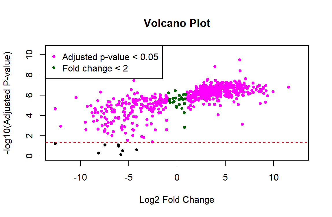
I am trying to use Limma for proteomic analysis on a sample size of n=8 controls and n=8 experimental. The code runs without errors, but the results show that nearly all 700 proteins are significant and the p-values are tiny (ex. 3.02e-10). I feel like something must be wrong with the data preprocessing because these results don't seem right. Also, the resulting volcano plot has a linear shape rather than looking like a usual volcano plot. Any help troubleshooting this would be greatly appreciated!
This is my code:
# Load necessary libraries
library("limma")
library("readxl")

# Import dataset
masterProteinData <- read_excel("C:\\Users\\abbey\\Downloads\\MasterProteins2.xlsx")
sampleInfo <- read_excel("C:\\Users\\abbey\\Downloads\\SampleInformation.xlsx")

# Extract protein abundance data
master_abundance <- as.matrix(masterProteinData[, -1])  # Assuming the first column contains protein IDs

# Perform normalization
#master_normalized <- normalizeBetweenArrays(master_abundance, method = "quantile")

# Create binary design matrix
design_matrix <- model.matrix(~ 0 + Condition, data = sampleInfo)

# Fit linear model
#fit <- lmFit(master_normalized, design_matrix)
fit <- lmFit(master_abundance, design_matrix)

# Perform statistical testing for differential abundance
fit <- eBayes(fit)

# Extract fitted values from the fit object using the fitted function
fitted_values <- fitted(fit)

# Plot the fitted values against the observed values
#plot(fitted_values, master_normalized, xlab="Fitted Values", ylab="Observed Values", main="Fit Plot")

# Extract results (including p-values; adjustment method Benjamini-Hochberg used)
master_results <- topTable(fit, coef = "ConditionExperiment", adjust.method = "BH", number = Inf)

# Add protein names as a column in master_results
protein_names <- masterProteinData[, 1]  # Assuming the first column contains protein names
master_results <- cbind(`Master Protein` = protein_names, master_results)

# Rename the title of the Master Protein column
colnames(master_results)[1] <- "Master Protein"

# Inspect master_results with protein names
#View(master_results)

# Inspect top differentially abundant proteins
top_proteins <- subset(master_results, abs(logFC) > 1 & adj.P.Val < 0.05)
#View(top_proteins)


## Visualization of top differentially abundant proteins

# Apply symmetrical log transformation to fold changes
fold_changes <- fit$coefficients[, "ConditionExperiment"] - fit$coefficients[, "ConditionControl"]
log2_fold_changes <- log2(abs(fold_changes) + 1) * sign(fold_changes)

# Define significance criteria
significant_indices <- which(master_results$adj.P.Val < 0.05 & abs(log2_fold_changes) > 1)
non_significant_indices <- which(master_results$adj.P.Val >= 0.05 & abs(log2_fold_changes) > 1)

# Create volcano plot with corrected fold changes
plot(log2_fold_changes, -log10(master_results$adj.P.Val), pch = 20,
     col = ifelse(1:length(log2_fold_changes) %in% significant_indices, "magenta",
                  ifelse(1:length(log2_fold_changes) %in% non_significant_indices, "black", "darkgreen")),
     main = "Volcano Plot",
     xlab = "Log2 Fold Change", ylab = "-log10(Adjusted P-value)",
     xlim = c(-max(abs(log2_fold_changes)), max(abs(log2_fold_changes))),
     ylim = c(0, max(-log10(master_results$adj.P.Val)) + 1))

# Add significance threshold line
abline(h = -log10(0.05), col = "red", lty = 2)

# Add legend for highlighted proteins
legend("topleft", legend = c("Adjusted p-value < 0.05", "Fold change < 2"),
       pch = 20, col = c("magenta", "darkgreen"))
Results from running the code:
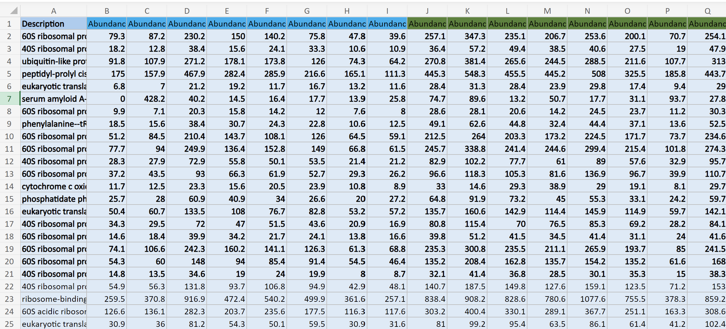
This is what my data structure for masterProteinData looks like:
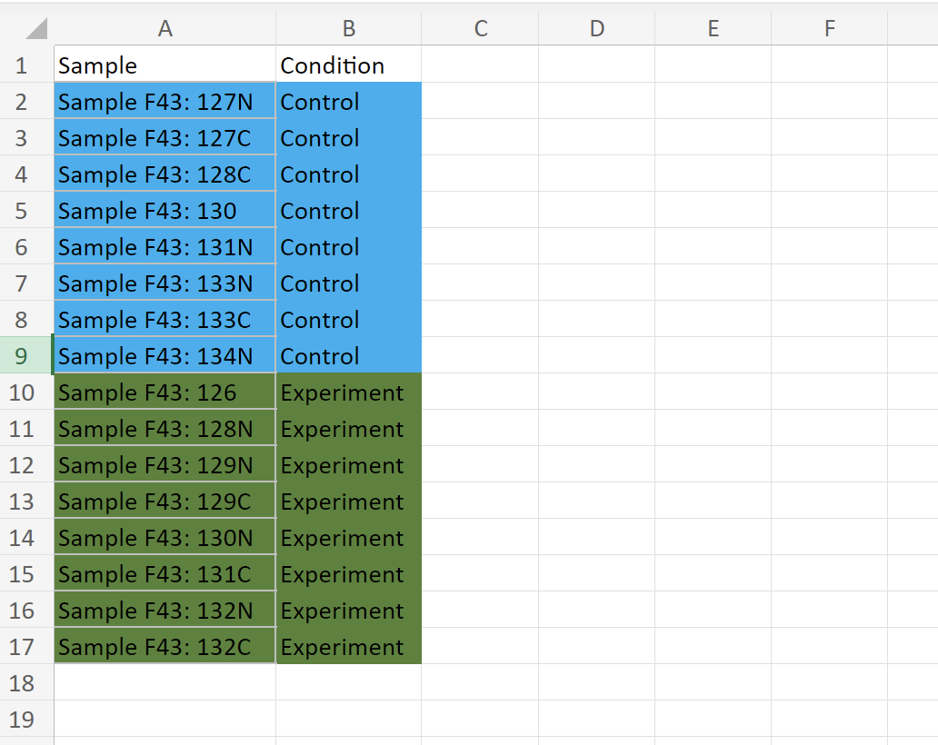
And this is the sampleInfo data frame:

I'd also add that plotting adjusted P-values in the y-axis of the volcano plot is not the recommended way to produce a volcano plot. This has been previously discussed in this forum, see for instance the answers in this post.
I'd argue that most users, especially the general reader of a paper is interested in a visual representation of the data and applied cutoffs, and that is FDR and not nominal p-value. These sorts of plots, unless used for diagnostic purposes during analysis (rather than in a results section) should imo directly allow to see the two populations of significant vs insignificant genes. In this context I see no point plotting nominal p-values as it can visually overestimate the number of DEGs.
For visualization purposes you can draw an horizontal line at the p-value cutoff that meets the experiment-wide FDR cutoff. For instance, if a
data.frameobjectttwould store the results of a call totopTable()you can draw such a line as follows:where
FDRcutoffwould store the FDR cutoff you want to use for selecting DE genes.It's not an implementation problem I am discussing (it's trivial obviously) -- more that for most purposes the y-axis metric should be the one productively used for analysis and downstream and this is almost always the FDR. Different opinions, that's fine.
From the point of view of visualization, I find handy the fact that raw p-values give more resolution than adjusted ones, which allows one to more easily highlight genes or proteins of interest; see for instance panels (a) and (c) in Figure 3 in this publication of mine. If dots overlap each other because different raw p-values correspond to the identical or very similar FDR values, then highlighting genes or proteins with names or colors becomes more difficult.
Thank you James! This worked to fix the p-values. However, the plot still looks one-sided... any idea what's going on with the left side? Did I calculate the fold change incorrectly?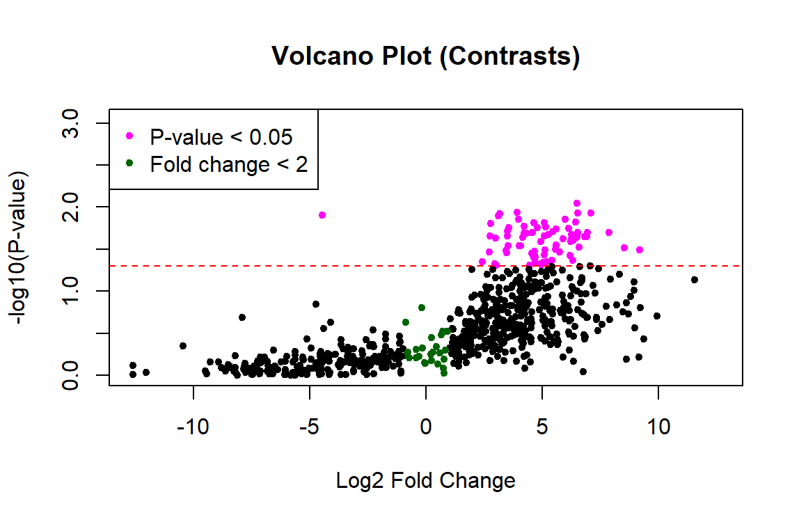
Probably. I would not expect such large fold changes. But without seeing your code, who knows?
This is the code. The only part I changed was adding the contrasts.fit as you suggested. Thanks for taking a look!
If you ever find yourself using the
@function, you should reconsider what you are doing. There are vanishingly small instances when an end user should use that accessor, and moreso for thelimmapackage, which barely makes use of the S4 paradigm. It's mostly just a simple list, and you can extract things using the$function instead.Also, you appear not to be normalizing your data at all, which is probably suboptimal. At the very least you should be doing a shift normalization, and you should be taking logs prior to that. If you do not take logs, then your coefficient will be the difference in protein abundance estimates rather than the log fold change, which is a much more interpretable measure. Put another way, assume for Protein X that you have a protein abundance (likely area under the curve of m/z intensities for a set of peptides) of say 1000 in one sample and 2000 in another. The difference is 1000, which seems large. Say you have another protein with 5000 in one sample and 10,000 in another. The difference there is 5000, which is bigger.
But both changes represent a simple doubling of the apparent protein concentration. It's of no interest that the 'baseline' area under the curve is 1000 for the first and 5000 for the second - those are derived quantities that are likely proportional to the amount of protein in a sample, but not quantitatively so. And this doesn't even consider the right skew inherent in this sort of data that you want to control for. So take logs, base 2.
You also most likely want to use
trend = TRUEand possiblyrobust = TRUEto account for an expected dependence of the variance on the mean abundance. Also there isvolcanoplotin the limma package, as well as theEnhancedVolcanopackage, both of which shield you from having to directly extract things, and make your life easier. All things equal, I use existing functionality rather than generating my own.