Hi there, I'm trying to do a decent (visually speaking) Volcano Plot and I would like that only values above 100 could be seen in this plot
options(ggrepel.max.overlaps = Inf)
EnhancedVolcano(significativiBlood,
                lab = rownames(significativiBlood),
                x = 'log2FoldChange',
                y = 'pvalue',
                xlab = bquote(~Log[2]~ 'fold change'),
                title = "Kidney",
                subtitle = "Differential expression",
                pCutoff = 10e-32,
                FCcutoff = 2.0,
                pointSize = 4.0,
                labSize = 6.0,
                colAlpha = 1,
                legendPosition = 'right',
                legendLabSize = 12,
                legendIconSize = 4.0,
                drawConnectors = TRUE,
                widthConnectors = 0.75)
I think that I have to do something with shapeCustom? But idk how to fix it... And what can I do to do a better design of this plot?
Many thanks for the support
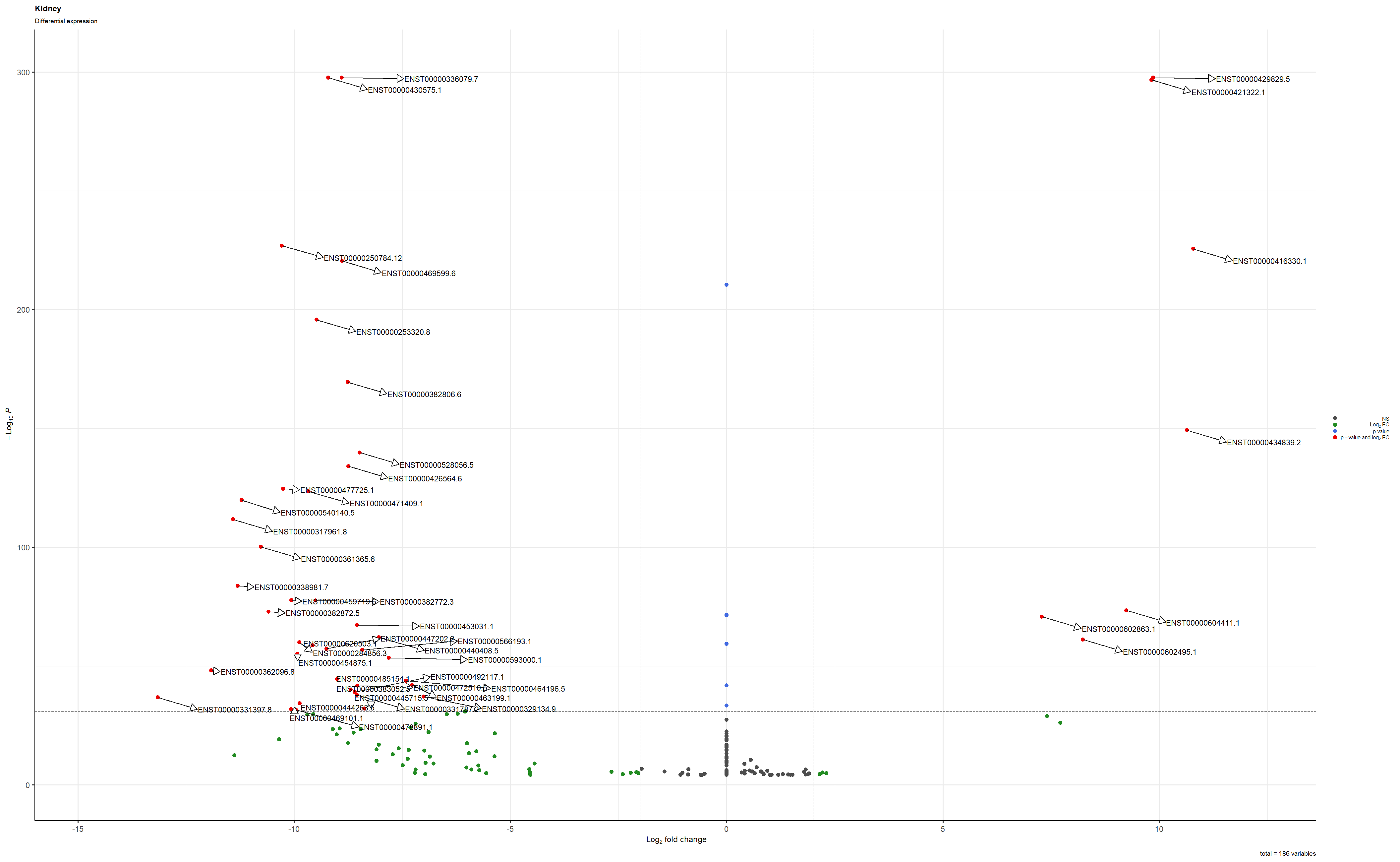
This is the plot saved as a png
sessionInfo( )
R version 4.0.3 (2020-10-10) Platform: x86_64-w64-mingw32/x64 (64-bit) Running under: Windows 10 x64 (build 18363)
Matrix products: default
locale: 1 LC_COLLATE=Italian_Italy.1252 LC_CTYPE=Italian_Italy.1252 LC_MONETARY=Italian_Italy.1252 [4] LC_NUMERIC=C LC_TIME=Italian_Italy.1252
attached base packages: 1 parallel stats4 stats graphics grDevices utils datasets methods base
other attached packages:
1 EnhancedVolcano_1.8.0 ggrepel_0.9.0 ggplot2_3.3.3
[4] tximport_1.18.0 DESeq2_1.30.0 SummarizedExperiment_1.20.0
[7] Biobase_2.50.0 MatrixGenerics_1.2.0 matrixStats_0.57.0
[10] GenomicRanges_1.42.0 GenomeInfoDb_1.26.2 IRanges_2.24.1
[13] S4Vectors_0.28.1 BiocGenerics_0.36.0
loaded via a namespace (and not attached):
1 httr_1.4.2 maps_3.3.0 bit64_4.0.5 splines_4.0.3
[5] blob_1.2.1 GenomeInfoDbData_1.2.4 vipor_0.4.5 numDeriv_2016.8-1.1
[9] Rttf2pt1_1.3.8 pillar_1.4.7 RSQLite_2.2.1 lattice_0.20-41
[13] glue_1.4.2 bbmle_1.0.23.1 extrafontdb_1.0 digest_0.6.27
[17] RColorBrewer_1.1-2 XVector_0.30.0 colorspace_2.0-0 plyr_1.8.6
[21] Matrix_1.3-0 XML_3.99-0.5 pkgconfig_2.0.3 emdbook_1.3.12
[25] genefilter_1.72.0 zlibbioc_1.36.0 mvtnorm_1.1-1 purrr_0.3.4
[29] xtable_1.8-4 scales_1.1.1 apeglm_1.12.0 ggrastr_0.2.1
[33] BiocParallel_1.24.1 tibble_3.0.4 annotate_1.68.0 farver_2.0.3
[37] generics_0.1.0 ellipsis_0.3.1 withr_2.3.0 survival_3.2-7
[41] magrittr_2.0.1 crayon_1.3.4 memoise_1.1.0 ash_1.0-15
[45] MASS_7.3-53 beeswarm_0.2.3 tools_4.0.3 lifecycle_0.2.0
[49] munsell_0.5.0 locfit_1.5-9.4 DelayedArray_0.16.0 AnnotationDbi_1.52.0
[53] compiler_4.0.3 ggalt_0.4.0 tinytex_0.28 rlang_0.4.10
[57] grid_4.0.3 RCurl_1.98-1.2 rstudioapi_0.13 labeling_0.4.2
[61] bitops_1.0-6 proj4_1.0-10 gtable_0.3.0 DBI_1.1.0
[65] R6_2.5.0 bdsmatrix_1.3-4 dplyr_1.0.2 bit_4.0.4
[69] extrafont_0.17 KernSmooth_2.23-18 ggbeeswarm_0.6.0 Rcpp_1.0.5
[73] vctrs_0.3.6 geneplotter_1.68.0 coda_0.19-4 tidyselect_1.1.0
[77] xfun_0.19


Hi / Ciao,
about the first question I think it's the result after the shrinkage of effect size...
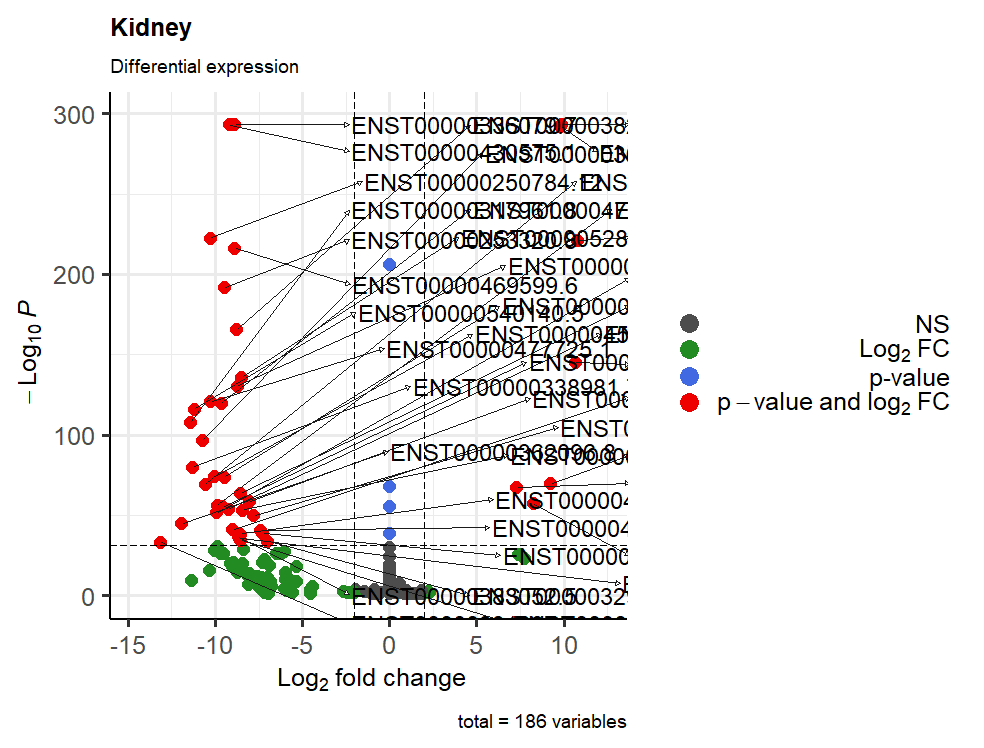
I tried to save using these settings png(file = "Volcano_Kidney.png", width=25, height=19, units = 'cm', res=100) and this is the result
And yes I mean to visualize only the transcripts above 100 of -log10(p-value), but I don't know what I should write...
Many thanks for your time and help
In this new plot ,you may want to use:
That should then give to you what you had wanted.
Note that
-log10(10^-100) == 100Later! / A dopo!
Grazie mille!
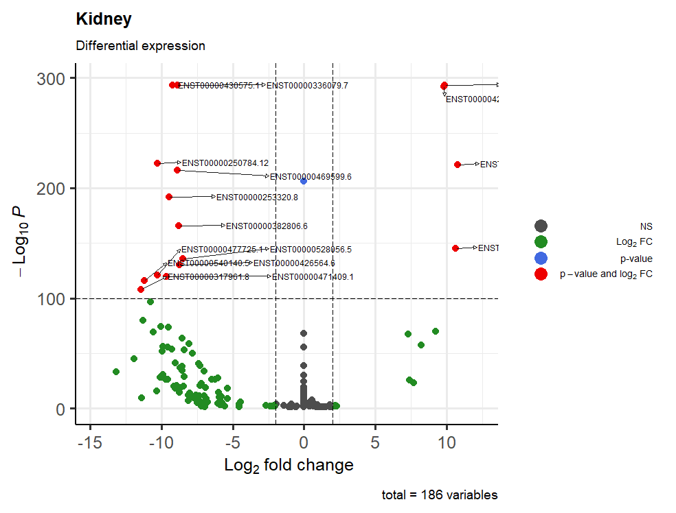
This is the result:
One last question: how can I manage to have all the writings inside the table? I tried with geom_text_repel(), sadly with no results
Thanks again!
Prego prego... For that, you can use
xlim, for example:Yes but it's not like a text_repel, I was searching something that fill completely the spaces, something like that send the arrows from the right to the left instead of further right.
So I resolved with xlim, thanks!
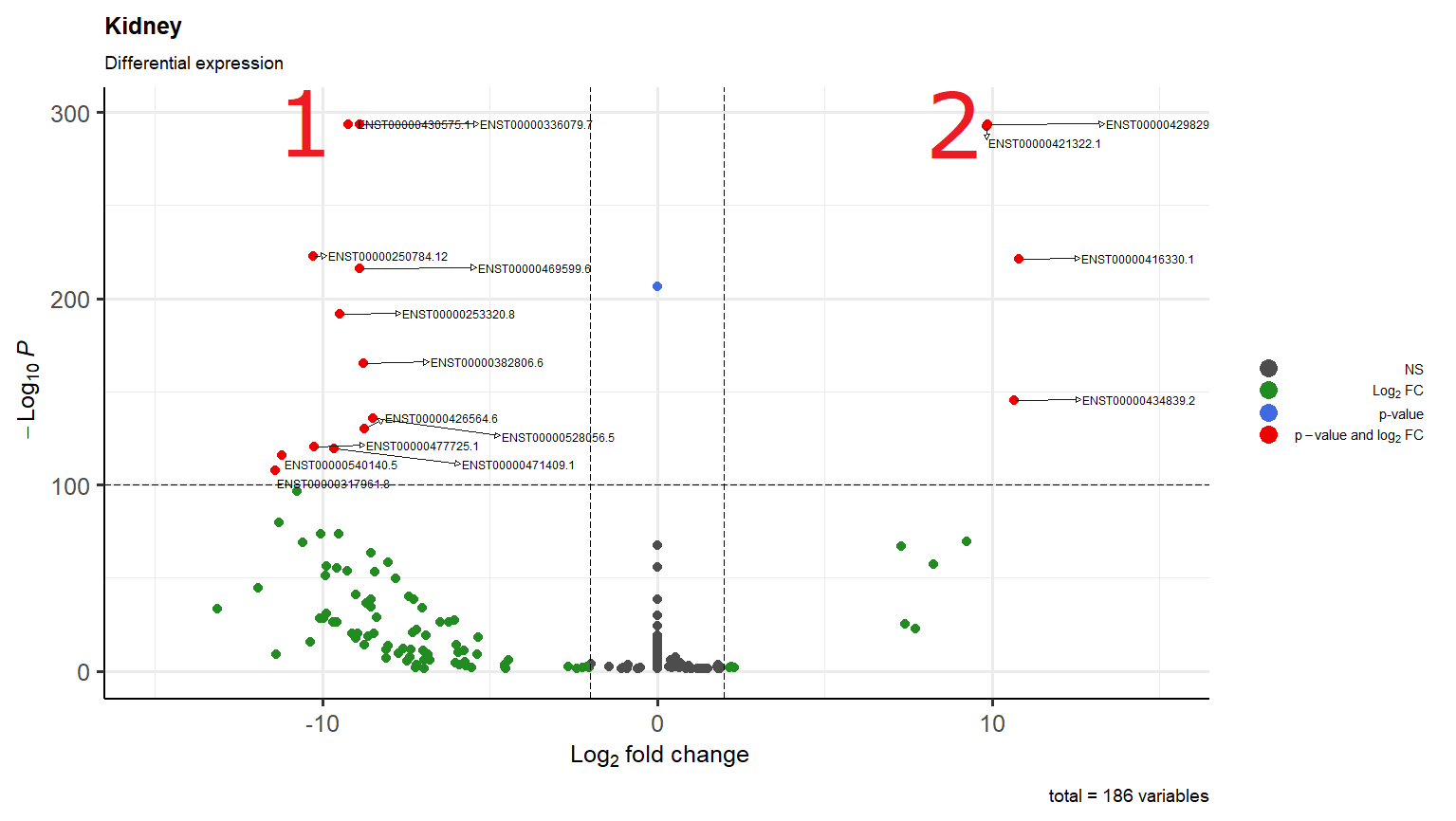
I'm just wondering why in scenario 1 it overlaps two transcripts while in scenario 2 one arrow go down and the other to the right
By the way thanks again and buonanotte!
They do not usually behave in that way (the connectors). For example, take a look here:
You could try to reduce the length, but I am not sure of the effect that this may have:
Grazie mille Kevin, sei stato davvero gentile. Alla prossima!
Ci vediamo dopo!