Entering edit mode

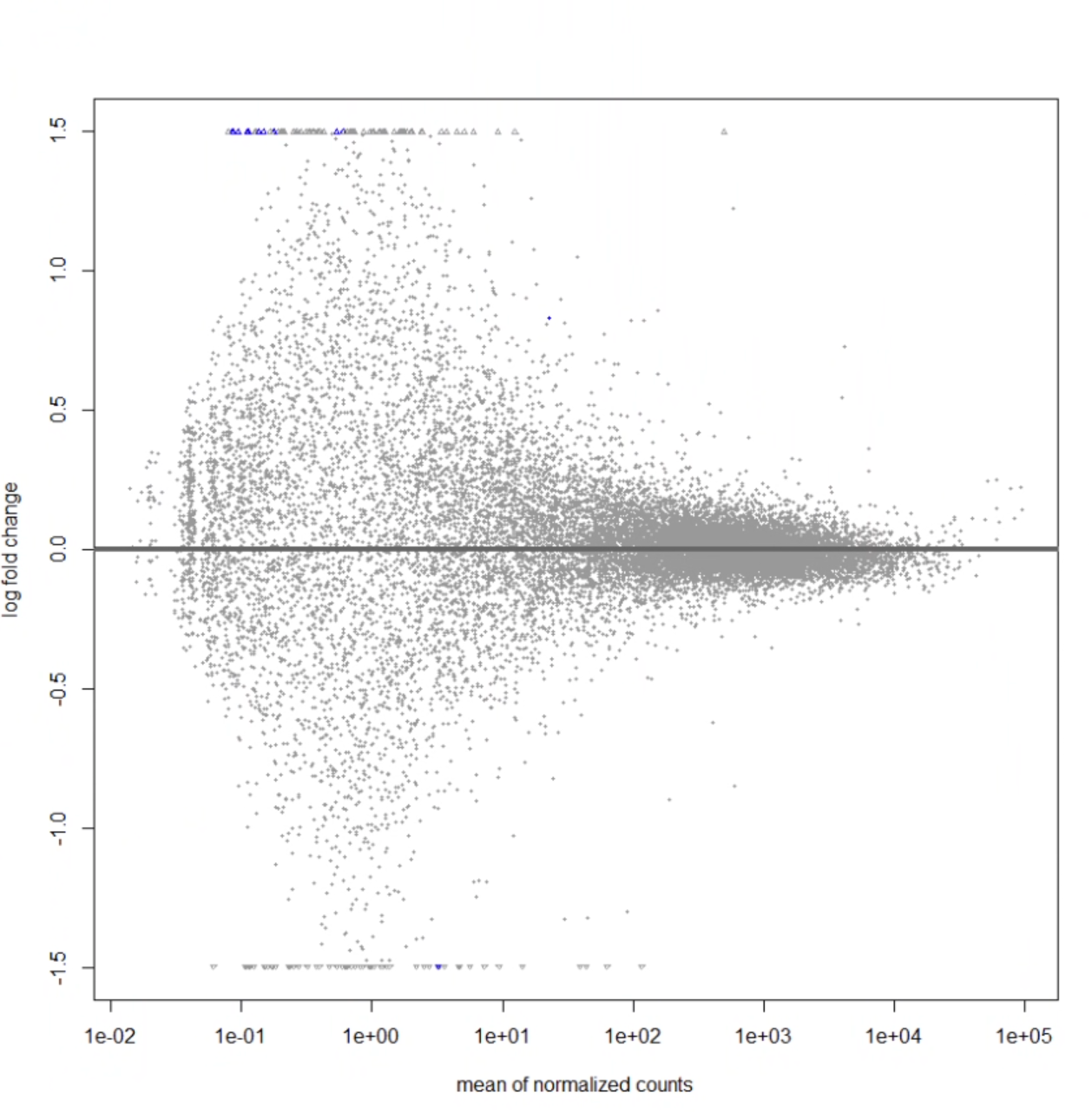
Hi. i'm running deseq analysis on data of RNA-seq data from a sample of 50 cortexes for diversity outbred mice between mice that were able to learn a cognitively demanding task, and mice that were not able to learn. Below is all the code I've been running. On doing this code, I am only getting 11 genes that have a padj-value < 0.05. This is what my MA plot looks like:
I guess I'm just super confused about the plot- how is it possible for there to be that blue dot in the center, but none of the genes around it are differentially expressed? should significant genes fall above or below some curve? Is it likely that i'm doing something wrong with my code? Would appreciate any help, thank you!
rownames(colData)<-colData$Sample.ID

#checking tha tall rownames in ColData match the column names in genes10
all(colnames(genes10) == rownames(colData))

#omit any NA values
genes10 <- na.omit(genes10)

#condition1 = added learner versus non learner categories to colData, condition2 = stage 6, 7, 8
colData$condition1 <- ifelse(colData$X7.Session>0,1,0)
colData$condition2 <- ifelse(colData$X8.Session>0,2,ifelse(colData$X7.Session>0,1,0))

#dds needs the design to be as a factor. and associates the 0 and 1 levels with learner and non learner
colData$condition1 <- factor(colData$condition1, levels = c(0,1), labels = c("non-learner", "learner"))
colData$condition2 <- factor(colData$condition2, levels = c(0,1,2), labels = c("non-learner", "6_7_learner", "8_learner"))
colData$Sex <- factor(colData$Sex, levels = c("M","F"), labels = c("male", "female"))
colData$ngen <- factor(colData$ngen, levels=c(50.2,49.1,46.1,47.1,48.1,44.2,45.1))
colData$batch <- factor(colData$batch, levels=c(1.5,1.0,2.0))

#second deseq2 object looking at condition 2: differences between non-learners and stage 8
dds2 <- DESeqDataSetFromMatrix(countData = round(genes10),
                               colData = colData,
                               design = ~ condition2 + Sex + batch + ngen)

dds2$condition2 <- relevel(dds2$condition2, ref = "non-learner")
dds2 <- DESeq(dds2)
res2 <- results(dds2)
res2 <- results(dds2, contrast=c("condition2","non-learner","8_learner"))

vsd2 <- vst(dds2, blind = FALSE)

#meanSD plots
ntd <- normTransform(dds)
library("vsn")
meanSdPlot(assay(ntd))
meanSdPlot(assay(vsd))

ntd2 <-normTransform(dds2)
meanSdPlot(assay(ntd2))
meanSdPlot(assay(vsd2))

#MA plot
MAplotdds <- plotMA(res)
MAplotdds2 <- plotMA(res2)
plotMA(dds2)

#heatmap method 1
install.packages("pheatmap")
library("pheatmap")
cdata <- colData(dds)
pheatmapdds <- pheatmap(assay(ntd),
         cluster_rows = FALSE,
         show_rownames = FALSE,
         cluster_cols = FALSE,
         annotation_col = as.data.frame(cdata[,"condition1"], row.names = rownames(cdata)))

vsddds2 <- vst(dds2, blind = FALSE) #did the variance stabilizing transformation again and stored it
#in vsddds2 because i am using vsd2 for another heatmap visualization below

#creating a dataframe that is ordered according to learner type
df_test <- as.data.frame(colData(dds2)[,c("Sample.ID", "condition2")])
df_test <- df_test[order(df_test$condition2),]
df_condition2 <- df_test$condition2
df_condition2 <- as.data.frame(df_condition2)

#heatmap displaying the variance stabilized expression values of all genes across condition 2: non learners, 6-7 learners, and 8 learners
pheatmap(assay(vsddds2),
        cluster_rows = TRUE,
        show_rownames = FALSE,
        cluster_cols = FALSE,
        annotation_col = as.data.frame(cdata[,"condition2"], row.names = rownames(cdata)))

#making sure rownames in df_condition2 correspond to col names in vsddds2
column_names_vsddds2 <- colnames(assay(vsddds2))
rownames(df_condition2) <- column_names_vsddds2

pheatmap(assay(vsddds2),
         cluster_rows = TRUE,
         show_rownames = FALSE,
         cluster_cols = FALSE,
         annotation_col =df_condition2, row.names = rownames(cdata), main = "Heatmap")

#the difference between the first and second heatmap here is that the second one is clustered by condition/learner type

scaled_data_total <- scale(assay(vsddds2), center = TRUE, scale = TRUE) #same heatmap as previous, just scaled. kinda looks the same tho so no point
pheatmap(scaled_data_total, cluster_rows = TRUE, show_rownames = FALSE, cluster_cols = FALSE, annotation_col = df_condition2, main = "Heatmap")

#heatmap method 2
select <- order(rowMeans(counts(dds2,normalized=TRUE)),
                decreasing=TRUE)[1:20] #selecting genes with the highest mean expression values based on normalized counts
df <- as.data.frame(colData(dds2)[,c("condition2")])

#colnames in vsddds2 correspond to rownames in df
column_names_vsddds2 <- colnames(assay(vsddds2))
rownames(df) <- column_names_vsddds2

#heatmap of variance stabilized expression values for top 20 genes with highest mean expression values based on normalized counts
pheatmap(assay(vsddds2)[select,], cluster_rows=TRUE, show_rownames=FALSE,
         cluster_cols=TRUE, annotation_col=df)

#heatmap of top 20 genes with highest mean expression values based on normalized counts in learners versus non learners, i.e., clustered by learner type
pheatmap(assay(vsddds2)[select,], cluster_rows=TRUE, show_rownames=FALSE, cluster_cols=FALSE, annotation_col=df_condition2, main="Heatmap")


scaled_data <- scale(assay(vsddds2)[select,], center = TRUE, scale = TRUE) #same heatmap as before, just scaled
pheatmap(scaled_data, cluster_rows = TRUE, show_rownames = FALSE, cluster_cols = FALSE, annotation_col = df_condition2, main = "Heatmap")

#selecting genes with the highest difference in expression between conditions:  highest absolute log2 fold change values
top_genes <- rownames(res2)[order(abs(res2$log2FoldChange), decreasing = TRUE)[1:20]]
scaled_data_topgenes <- scale(assay(vsddds2)[top_genes,], center = TRUE, scale = TRUE)

#heatmap representing the top 20 genes with highest difference in expression based on log2 fold change values
pheatmap(scaled_data_topgenes, cluster_rows = TRUE, show_rownames = FALSE, cluster_cols = FALSE, annotation_col = df_condition2, main = "Heatmap")

gotcha, thank you for the advice, i'll keep that in mind for the future! here's what the PCA plot looks like. I'm still super new to deseq2 and statistical visualizations of data in general, so i didnt really know how to interpret the PCA plot